
柔软蜡笔线与不规则颗粒形成印刷灰阶,浓淡墨迹贴合纸面,保留细腻的石版调子。
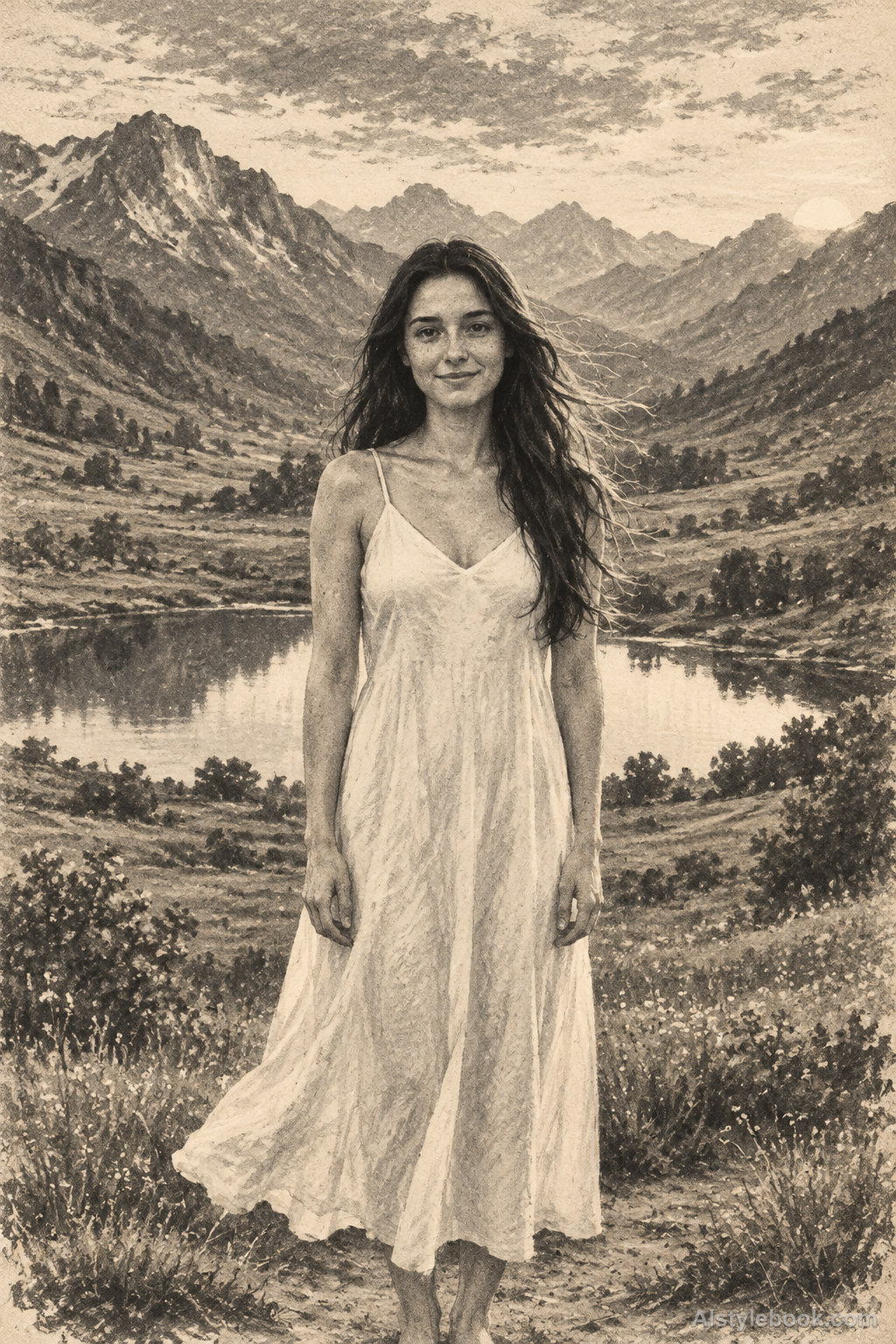
人物风格效果
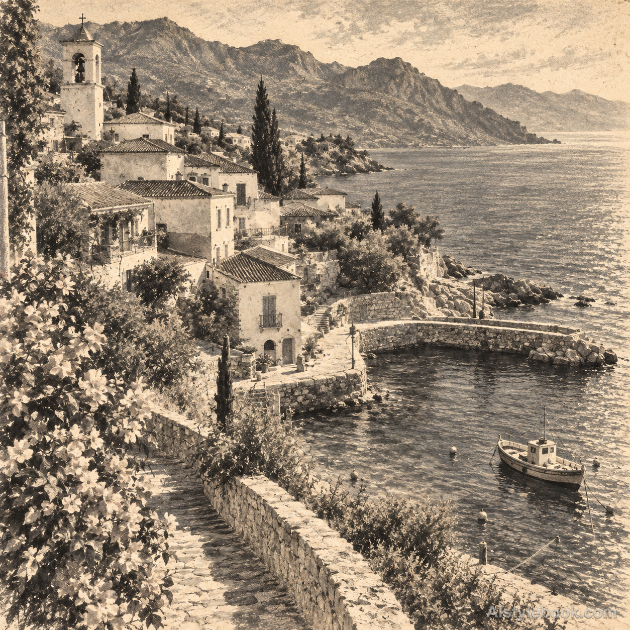
风景风格效果
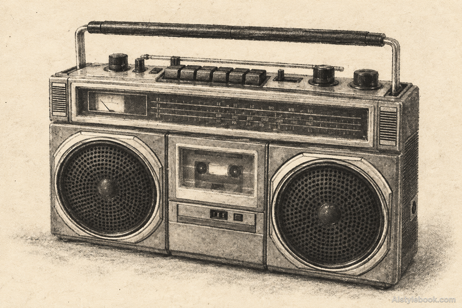
物品风格效果
认识风格
石版画是什么
石版画的灰调来自柔软蜡笔痕与细密、不规则的印墨颗粒。宽擦与细线自然衔接,深处形成带颗粒的黑,浅处露出纸白。整个图像像薄墨转印在纸上,表面平整而层次细腻。
石版画属于平版印刷,利用油性与水的排斥关系成像,蜡笔式颗粒和柔灰并不来自刻出的凹线。
例如一张脸的暗侧由细密颗粒积成,亮侧露出纸白,转印表面仍平整,近看像柔软蜡笔留下的印迹。
不同主体的表现
- 人物
- 肤色和衣物被有限版色统一,颗粒、笔痕或叠版让人物更有印刷感。
- 风景
- 景物化成可分色的层次,天空和建筑的大色面更突出。
- 物品
- 器物反光被压成版色与留白,表面带墨层质感,细字可能简化。
- 建议主体
- 优先选轮廓明确的人物、建筑、花果或简洁产品,让少量颜色就能说明主体。
把风格带入你的照片
石版画的可复用风格提示词
Preserve the original composition, identifying proportions and spatial relationships. Translate the whole image into a monochrome crayon lithograph on warm uncoated paper. Use soft greasy-crayon lines with granular broken edges, broad pressure-varied crayon shading and fine irregular ink speckles. Build gray tones by changing grain density, letting pale passages expose paper and deep values gather into softly textured black. Keep the printed ink thin and flat, with restrained uneven coverage and clear defining contours. Avoid regular halftone dots, crosshatching, carved wood grooves, powdery pastel buildup, wiped monotype streaks and artificial aged-paper stains.人物、风景与物品共用这份风格提示词。
用这个风格创作继续探索


