
可读文字按疏密与大小组成清晰形体,强色彩反差和大留白突出字形构造。
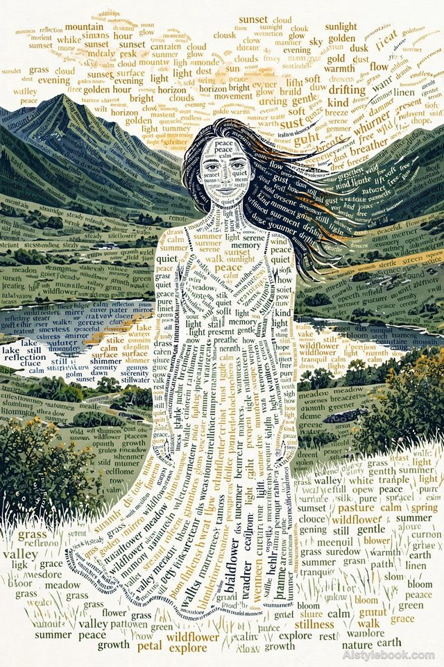
人物风格效果
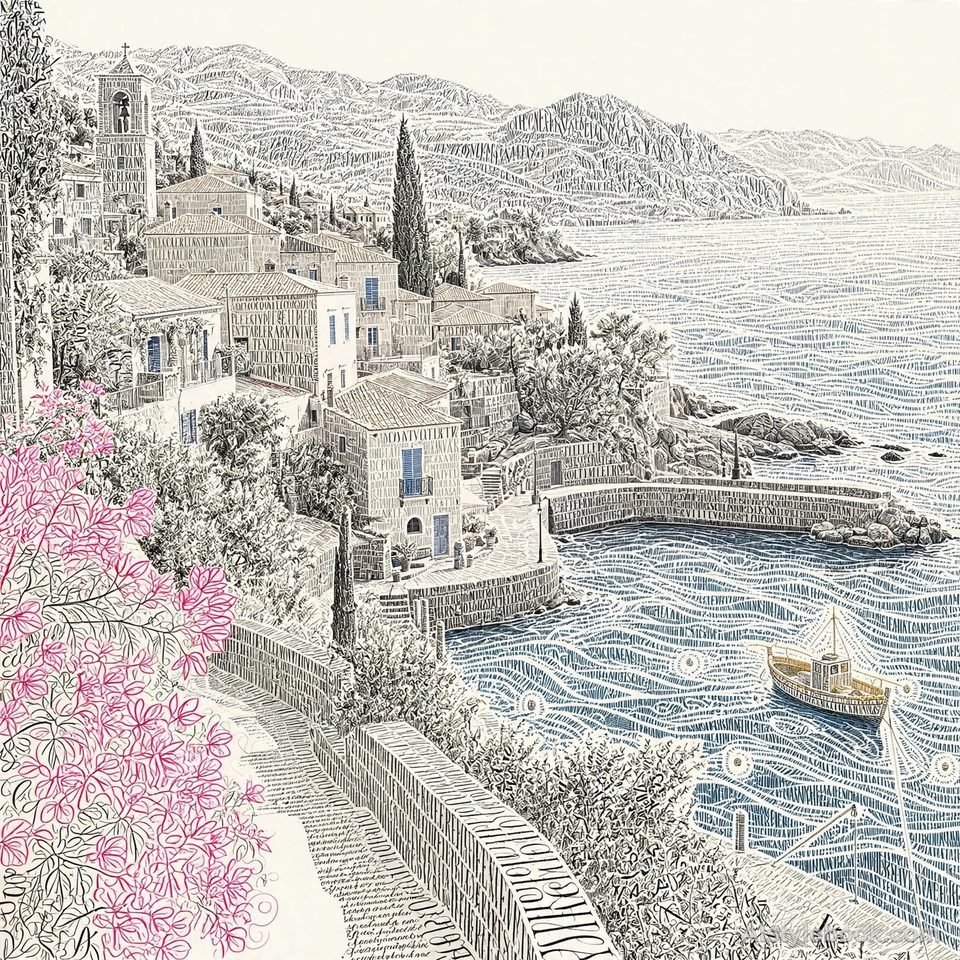
风景风格效果
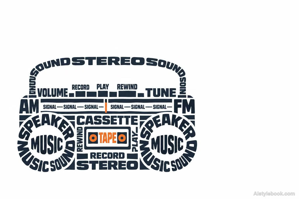
物品风格效果
认识风格
文字云艺术海报是什么
文字沿轮廓和内部骨架排列,字号、疏密与旋转共同构成明暗。远处先看见形体,近处才读到组成它的词。
文字造形同时安排阅读距离:远看文字密度形成图像,近看词义又给形象增加另一层解释。
例如把与海洋有关的词排成浪峰,细小字组构成浪花,文字既是内容也是轮廓的一部分。
不同主体的表现
- 人物
- 脸部和头发由文字疏密构成,细小五官被简化,远看轮廓比近看字词更重要。
- 风景
- 山脊、树冠和建筑成为文字流动的边界,景深通过字群密度组织。
- 物品
- 器物曲面由文字方向和大小塑造,反光转成字间留白。
- 建议主体
- 优先选侧脸、树形、瓶形或轮廓独特的物件;简单背景能让文字与整体形象同时可读。
把风格带入你的照片
文字云艺术海报的可复用风格提示词
Make readable words construct the subject's form itself. Use word size, rotation, paths, and clustering to build contours and an underlying skeleton. Dense dark text should model shadows, while sparse fine words create dissolving highlight edges. From a distance the form must read clearly; up close it should consist entirely of words. Choose a few vivid dominant colors against a near-white ground, leaving generous negative space. Keep vocabulary relevant to the subject rather than mechanically repetitive.人物、风景与物品共用这份风格提示词。
用这个风格创作继续探索


