
Illustration & Design
Calligram Word Art
Style guide
Readable words form a clear subject through changes in density and size, with strong color contrast and open space emphasizing typographic construction.
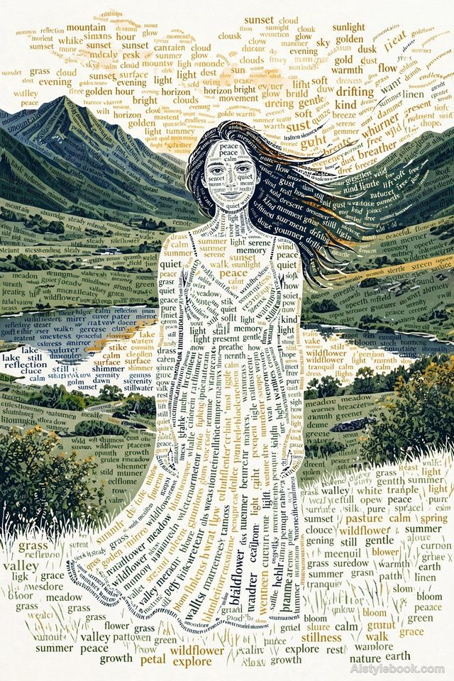
PortraitStyle effect
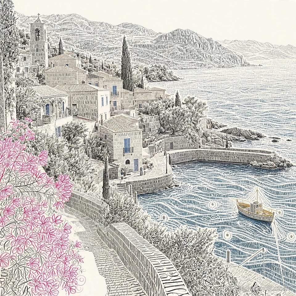
LandscapeStyle effect
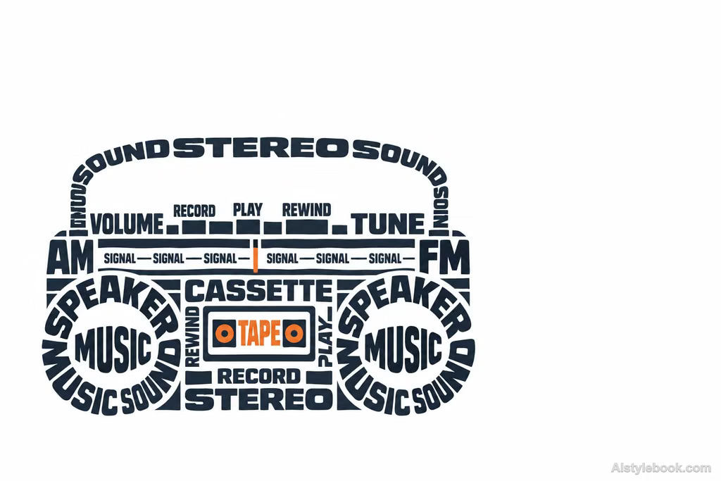
ObjectsStyle effect
The visual language
What is Calligram Word Art?
Words follow the contour and internal framework, with size, density and rotation building the tonal structure. The shape reads first at a distance, then reveals its vocabulary up close.
A calligram works at two distances: text density creates an image and individual words add meaning.
Ocean-related words arranged into a cresting wave can function as both language and contour.
How the style changes different subjects
- Portrait
- Text density builds face and hair, simplifying small features into a silhouette readable at a distance.
- Landscape
- Ridges, trees and buildings guide the flow of words; density organizes depth.
- Objects
- Text direction and scale describe curved objects, with gaps supplying highlights.
- Subjects
- Choose profiles, trees, bottles or distinctive objects against simple backgrounds so text and overall shape can coexist.
Bring the style to your photos
Reusable style prompt for Calligram Word Art
Make readable words construct the subject's form itself. Use word size, rotation, paths, and clustering to build contours and an underlying skeleton. Dense dark text should model shadows, while sparse fine words create dissolving highlight edges. From a distance the form must read clearly; up close it should consist entirely of words. Choose a few vivid dominant colors against a near-white ground, leaving generous negative space. Keep vocabulary relevant to the subject rather than mechanically repetitive.Use the same style prompt for portraits, landscapes and objects.
Create with this styleKeep exploring


