
平行边与统一等距投影带来理性空间,粉彩色面和简洁阴影突出几何体积。
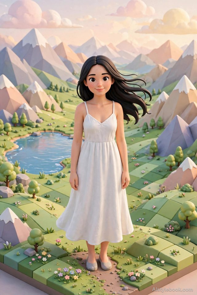
人物风格效果
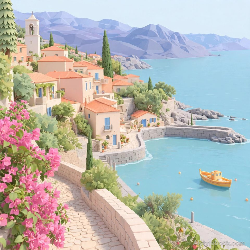
风景风格效果
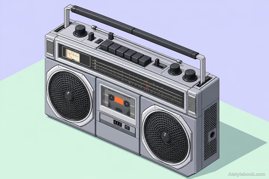
物品风格效果
认识风格
等距插画是什么
平行边在空间中保持平行,三个方向采用一致缩短比例;物体靠顶面和侧面的色差显出体积。整张图像像可逐项阅读的小型系统。
等距图没有近大远小的汇聚感,同一方向的边可以跨越整张图继续对齐,因而特别像模型说明图。
想象把房屋屋顶揭开,同时看见房间、家具和道路,各部分像放在同一张可量读的桌面上。
不同主体的表现
- 人物
- 人物呈小型立体单元,姿态与位置比面部细节更重要。
- 风景
- 建筑、道路和房间沿统一斜向坐标展开,空间结构更像可读模型。
- 物品
- 顶部与侧面同时可见,物件更像几何模块,结构关系更清楚。
- 建议主体
- 优先选房间、建筑群、设备或成组物件,清楚的方位和模块关系更适合等距表现。
把风格带入你的照片
等距插画的可复用风格提示词
Use strict orthographic isometric projection with equal foreshortening along all three spatial axes. Keep the vertical axis vertical and the other two approximately thirty degrees above and below the horizontal. Parallel edges must never converge, and scale must not diminish with distance. Convey volume through clear geometry, soft pastel colors, and simple faceted shadows. Apply one consistent projection throughout and keep the subject's structure recognizable.人物、风景与物品共用这份风格提示词。
用这个风格创作继续探索


