
节省黑线与双色几何把形体转为平面图解,保有世纪中期手工印刷的朴拙幽默。
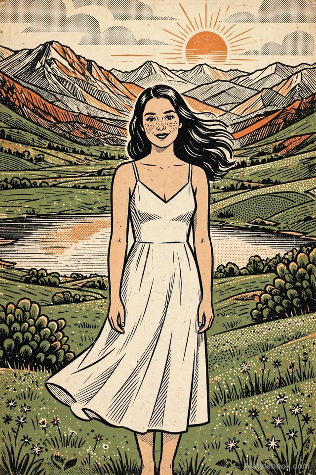
人物风格效果
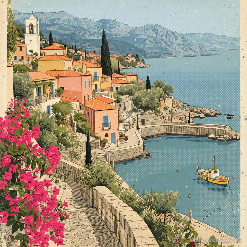
风景风格效果
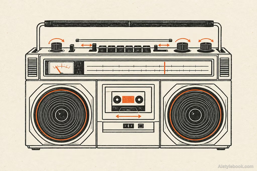
物品风格效果
认识风格
世纪中期插画海报是什么
节省的黑线与双色几何把对象转成老说明书般的平面图解,比例略夸张。手工套印小误差让清楚连接带着朴拙幽默。
这类中世纪现代图解借用简洁轮廓、有限印色和略带幽默的比例,让信息像老科普书一样容易阅读。
例如把收音机的旋钮放大,内部结构化成几条连接线,画面便同时有解释性和朴拙趣味。
不同主体的表现
- 人物
- 身体与衣服简化为有节奏的色面,表情轻松,比例带有适度插画夸张。
- 风景
- 树木、房屋与地形以有限配色分层,颗粒和纹样增强平面趣味。
- 物品
- 器物变为简练几何形与哑光色区,表面细节减少,图形感更强。
- 建议主体
- 优先选家居、植物、交通工具或姿态鲜明的人物,让有限色彩与清楚剪影发挥作用。
把风格带入你的照片
世纪中期插画海报的可复用风格提示词
Express the subject through mid-century vernacular graphics and schematic line drawing. Compress complex structures into geometric blocks, functional contours, and essential connections. Keep black pen-like lines direct and economical, using limited two-color spot printing and flattened space, with moderately naive exaggerated proportions. Organize negative space through clear narrative relationships, scale contrasts, and positive-negative forms. Preserve slight handmade printing irregularity for the lucid, humorous diagrammatic character of an old instruction manual.人物、风景与物品共用这份风格提示词。
用这个风格创作继续探索


