
Illustration & Design
Mid-century Illustration
Style guide
Economical black lines and two-color geometry turn forms into flat diagrams, retaining the naive humor of mid-century handmade printing.
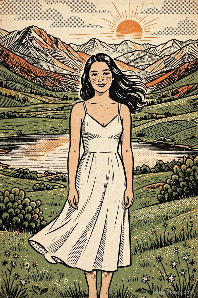
PortraitStyle effect
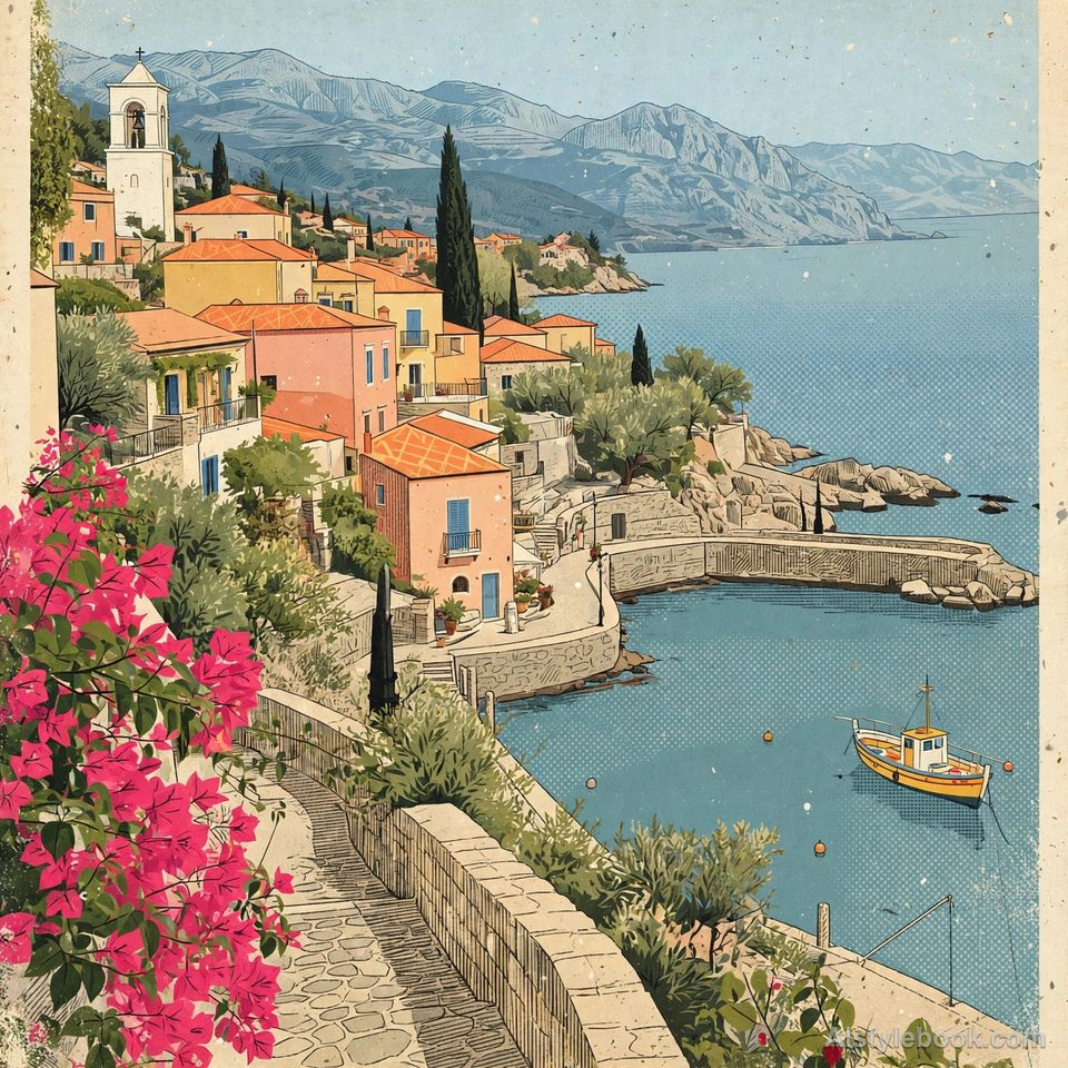
LandscapeStyle effect
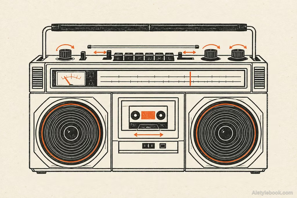
ObjectsStyle effect
The visual language
What is Mid-century Illustration?
Economical black lines and two-color geometry turn objects into flat diagrams reminiscent of old manuals, with gently exaggerated proportions. Small printing irregularities add naive humor to clear connections.
This mid-century treatment combines limited inks, clear outlines and gently exaggerated proportions.
An enlarged radio dial and simplified internal connections can make an image informative and playfully approachable.
How the style changes different subjects
- Portrait
- Rhythmic color shapes simplify bodies and clothing with relaxed expressions and mild exaggeration.
- Landscape
- Limited colors layer trees, buildings and terrain, with grain and pattern adding graphic interest.
- Objects
- Simple geometry and matte color replace fine surface detail.
- Subjects
- Choose interiors, plants, transport or distinctive poses with clear silhouettes and a limited palette.
Bring the style to your photos
Reusable style prompt for Mid-century Illustration
Express the subject through mid-century vernacular graphics and schematic line drawing. Compress complex structures into geometric blocks, functional contours, and essential connections. Keep black pen-like lines direct and economical, using limited two-color spot printing and flattened space, with moderately naive exaggerated proportions. Organize negative space through clear narrative relationships, scale contrasts, and positive-negative forms. Preserve slight handmade printing irregularity for the lucid, humorous diagrammatic character of an old instruction manual.Use the same style prompt for portraits, landscapes and objects.
Create with this styleKeep exploring


