
Anime & Comics
Heavy-Ink Graphic Novel
Style guide
Broad black shadows cut against sharp white light, with abrupt line-weight changes and sparse scraped highlights creating forceful heavy-ink rhythm.
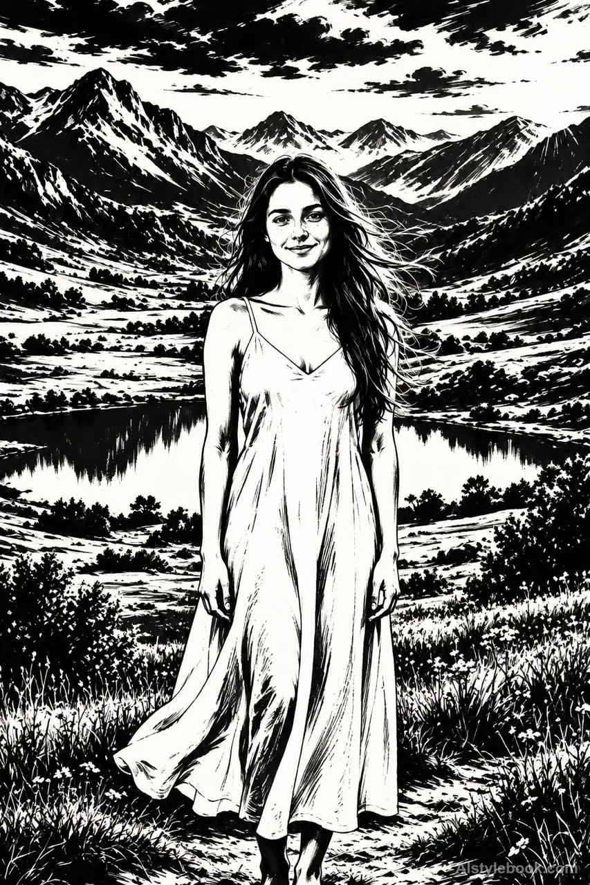
PortraitStyle effect
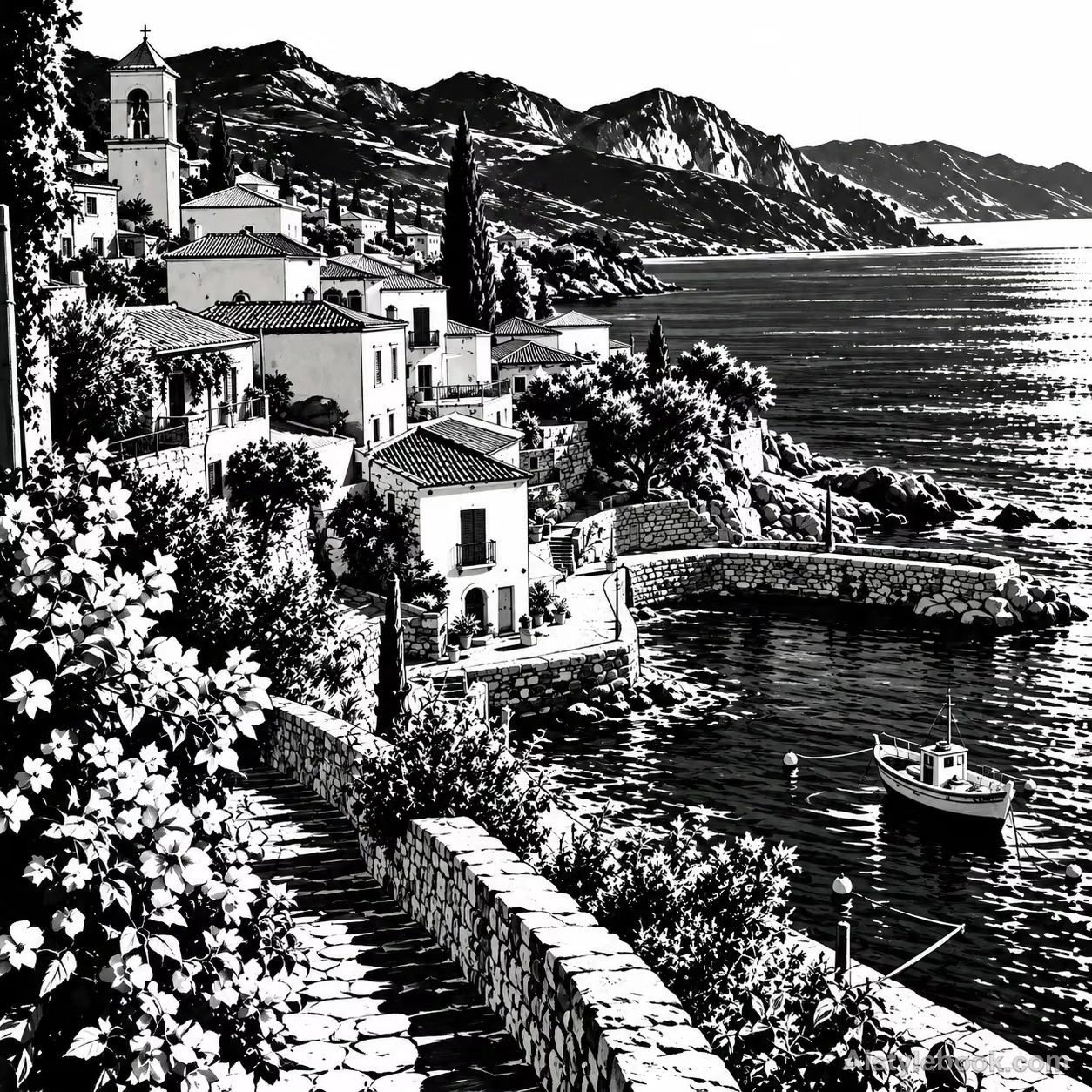
LandscapeStyle effect
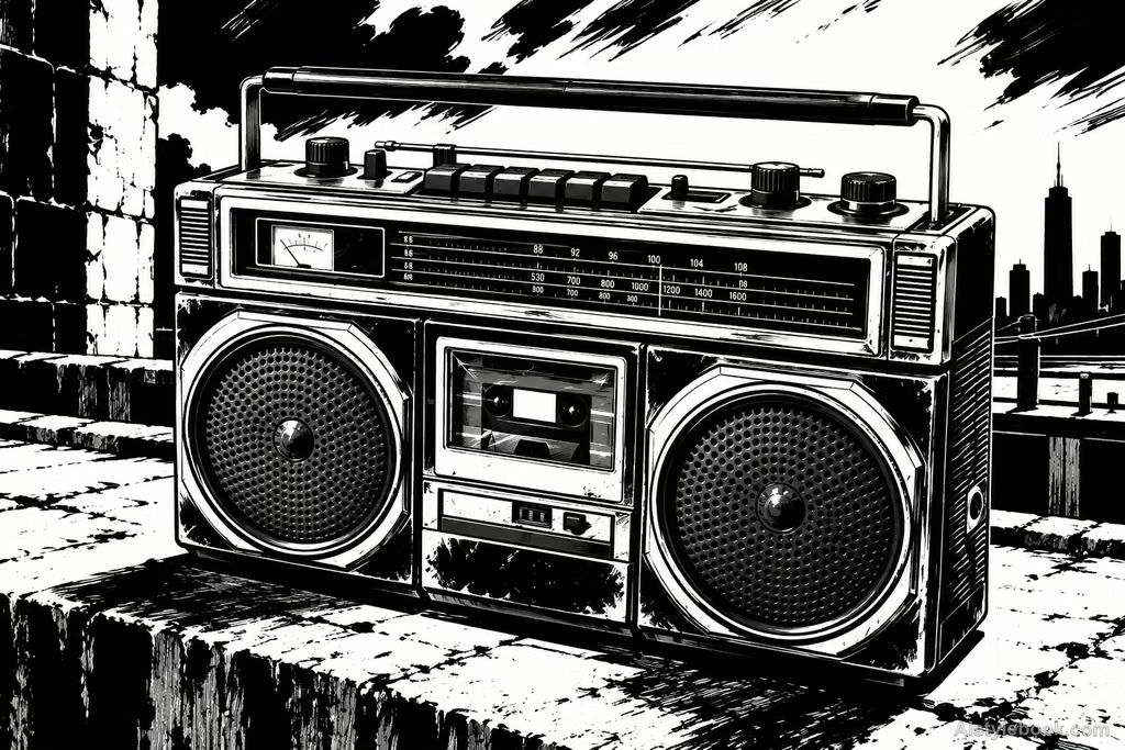
ObjectsStyle effect
The visual language
What is Heavy-Ink Graphic Novel?
Broad ink blacks meet sharp white light, with sparse scraped highlights revealing structure inside shadow. Sudden shifts of line weight reinforce action and narrative weight, keeping detail subordinate to the overall black-white rhythm.
Heavy-ink graphic novels use large dark masses and selective white cuts to pace attention.
An eye and a sharp lit edge can reveal an alert figure while leaving the surroundings unresolved.
How the style changes different subjects
- Portrait
- Heavy blacks absorb face and clothing, with a few white edges carrying intense expression.
- Landscape
- Buildings, trees and alleys become weighty black-white masses with light directing the eye.
- Objects
- Cut-out highlights simplify material and give objects a strong, dramatic presence.
- Subjects
- Choose side-lit figures, night streets, industrial objects or bold still lifes with clear light and dark regions.
Bring the style to your photos
Reusable style prompt for Heavy-Ink Graphic Novel
Redraw the image in a heavy-ink graphic-novel language. Organize major volumes through decisive solid black masses and sharply cut paper-white light, capturing key turns with brush contours that shift abruptly in width. Concentrate detail into sparse white scratched highlights and crisp short strokes, maintaining clear proportions and layout. Tiny dry-brush breaks at black edges enrich a strong light-dark rhythm, using economical brushwork and negative space for a composed, dramatic ink drawing.Use the same style prompt for portraits, landscapes and objects.
Create with this styleKeep exploring


