
风格对比
AI 水彩与水粉怎么选:透明晕染还是浓实色块?
用同一组人物、风景和物品,比较透明晕染与不透明色块。
想要透光的叠色和柔和过渡,选水彩;想要哑光、浓实的色块与较清楚的分区,选不透明水粉。
同一张参考图,哪里变了?
查看参考原图


水彩 ↗
想要清透感、纸张纹理和自然融开的局部边缘时,可以先试水彩。
检查软边和实边是否有变化。均匀模糊并不能代替水彩晕染的层次。

不透明水粉 ↗
想要哑光插画、层叠形体与更强的颜色覆盖感时,可以先试不透明水粉。
检查叠压色块和局部笔触。油亮或明显隆起的厚涂表面属于另一种方向。
| 观察位置 | 水彩 | 不透明水粉 |
|---|---|---|
| 亮部 | 浅色晕染与近似留白的区域 | 深色上叠加的浅色绘画形体 |
| 过渡 | 洇染与轻薄的颜色沉积 | 相对明确、不规则的笔触边界 |
| 风景 | 远景更轻,空气感较明显 | 山脉与田野的层次分区更明确 |
换成风景和物品,再看一遍
风景
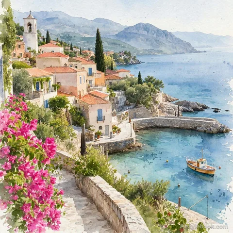
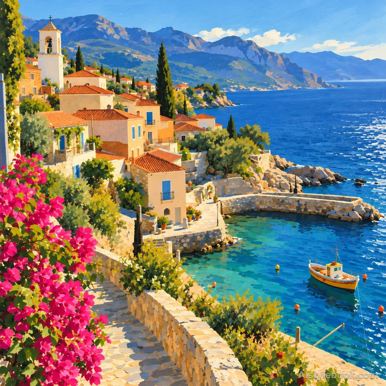
物品
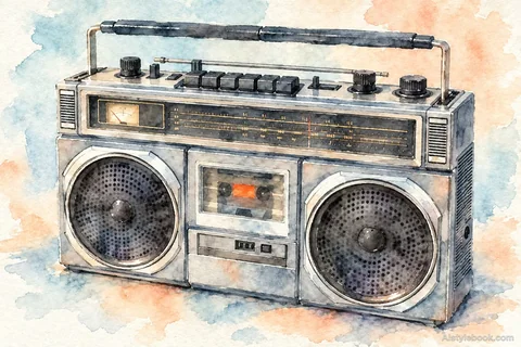
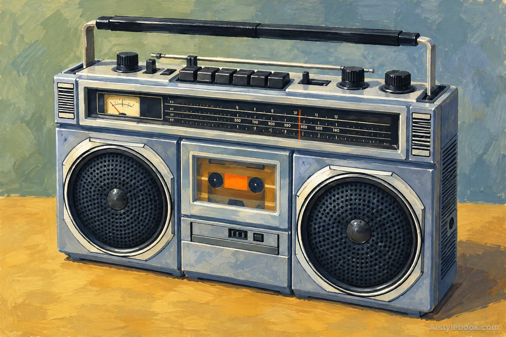
用自己的图片怎么试
- 比较时保持主体、构图和模型一致。使用同一张参考图,或给两条提示词配上相同的主体描述。
- 水彩强调透明颜料、纸白和干湿边缘变化;水粉强调不透明哑光颜料与层叠色块。
- 先看人物,再对照下方风景与物品。打算做成系列前,用自己的主体多试几次。
图鉴示例用于说明视觉区别,不是受控的模型测试。提示词可以引导方向,无法保证某种颜料质感;判断结果时,请看边缘和覆盖关系。
复制风格提示词
这些是图鉴公开的风格提示词。配合自己的主体或参考图使用;不同模型的结果可能不同。
水彩
Shape the subject through layers of transparent watercolor pigment, allowing wet colors to bleed and blend naturally into soft edges, tide marks, pale deposits, and occasional dry-brush marks. Let paper fibers show through thin washes and preserve paper white in bright areas. Keep dark colors transparent and brushwork relaxed while key structures remain accurate. Build light and shade through water and layered color for a luminous, airy result, avoiding opaque impasto and uniform blur.不透明水粉
Paint the subject in matte opaque gouache. Use dense color shapes to organize structure and tone clearly, allowing light paint to genuinely cover dark layers. Preserve softly irregular hand-painted boundaries, local broken dry-brush marks, and moderate changes in paint thickness. Keep the surface quiet with delicate paper character. Build clear, harmonious layers through overlapping color blocks rather than transparent bleeding, wet oil gloss, or highly raised paint buildup.