
Style comparison
Watercolor vs Gouache for AI Images: Which to Choose?
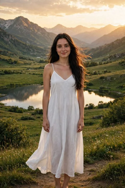
Compare transparent washes with opaque painted shapes, using the same portrait, landscape and object references.
Choose watercolor for light showing through washes and softer transitions. Choose gouache for matte, opaque color shapes and clearer separation between painted areas.
One reference. What changes?
View the reference image
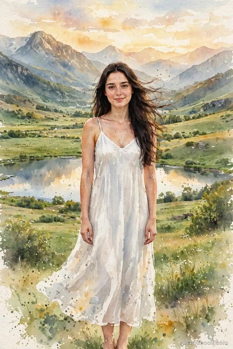
Watercolor ↗
Start here when you want luminosity, visible paper and areas that dissolve softly into one another.
Look for a mix of soft and firm edges. A uniformly blurred image does not show the same variety as watercolor washes.
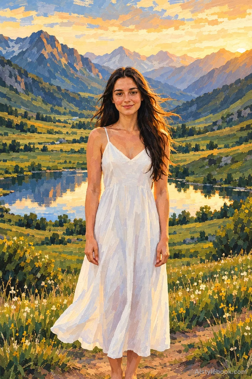
Gouache ↗
Start here when you want a matte illustration with layered shapes and stronger color coverage.
Look for overlapping flat color and local brush marks. A glossy or heavily raised surface is a different direction.
| What to compare | Watercolor | Gouache |
|---|---|---|
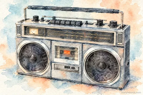
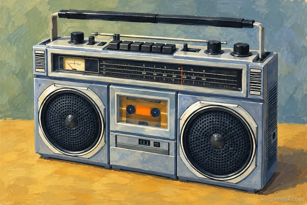
| Light areas | Pale washes and paper-like white | Light painted shapes over darker areas |
| Transitions | Bleeding and soft deposits of color | More distinct, irregular painted boundaries |
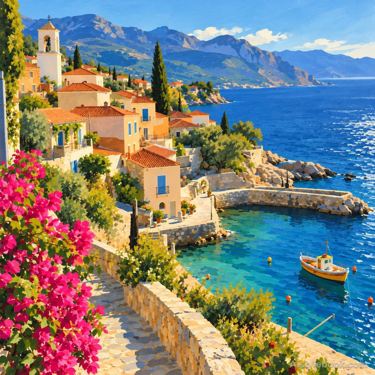
| Landscape | Atmospheric distance and lighter texture | More separated bands of mountain and field |
Compare landscapes and objects too
Landscape
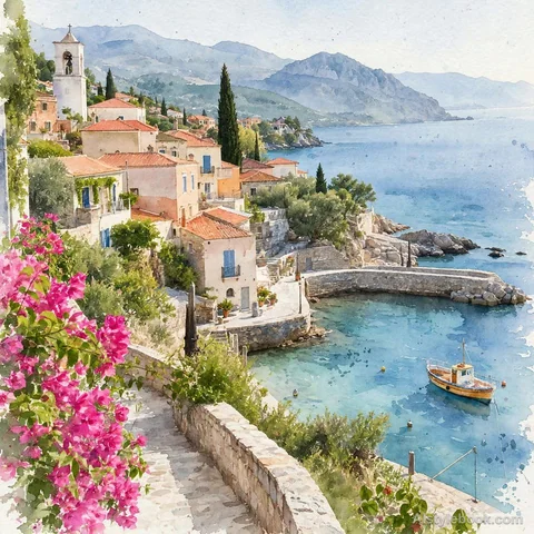
Object
Try it with your own image
- Keep the subject, composition and model fixed when comparing. Upload the same reference, or use the same subject description for both prompts.
- For watercolor, describe transparent pigment, reserved paper white and varied wet and dry edges. For gouache, describe opaque matte paint and overlapping color shapes.
- Inspect the portraits first, then compare the landscape and object examples below. Repeat the preferred look on your own subject before using it for a series.
These library examples illustrate visual differences; they are not a controlled model test. A prompt can steer the look but cannot guarantee a particular paint texture. Judge the output by its edges and coverage, not by the style label alone.
Copy a style prompt
These are the public style prompts from the atlas. Combine one with your own subject or reference image; results vary between models.
Watercolor
Shape the subject through layers of transparent watercolor pigment, allowing wet colors to bleed and blend naturally into soft edges, tide marks, pale deposits, and occasional dry-brush marks. Let paper fibers show through thin washes and preserve paper white in bright areas. Keep dark colors transparent and brushwork relaxed while key structures remain accurate. Build light and shade through water and layered color for a luminous, airy result, avoiding opaque impasto and uniform blur.Gouache
Paint the subject in matte opaque gouache. Use dense color shapes to organize structure and tone clearly, allowing light paint to genuinely cover dark layers. Preserve softly irregular hand-painted boundaries, local broken dry-brush marks, and moderate changes in paint thickness. Keep the surface quiet with delicate paper character. Build clear, harmonious layers through overlapping color blocks rather than transparent bleeding, wet oil gloss, or highly raised paint buildup.