
Illustration & Design
Neo-Brutalist Graphic
Style guide
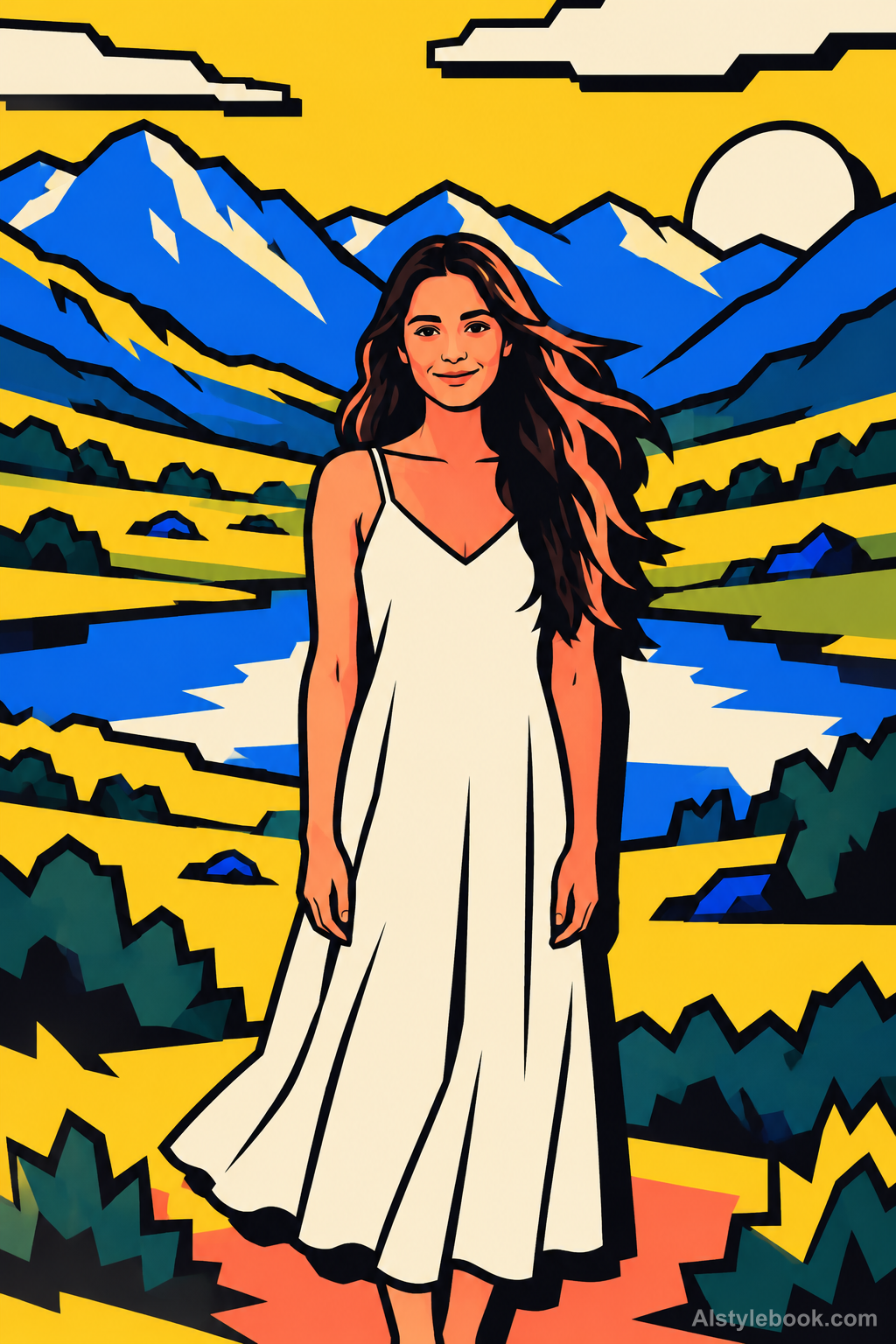
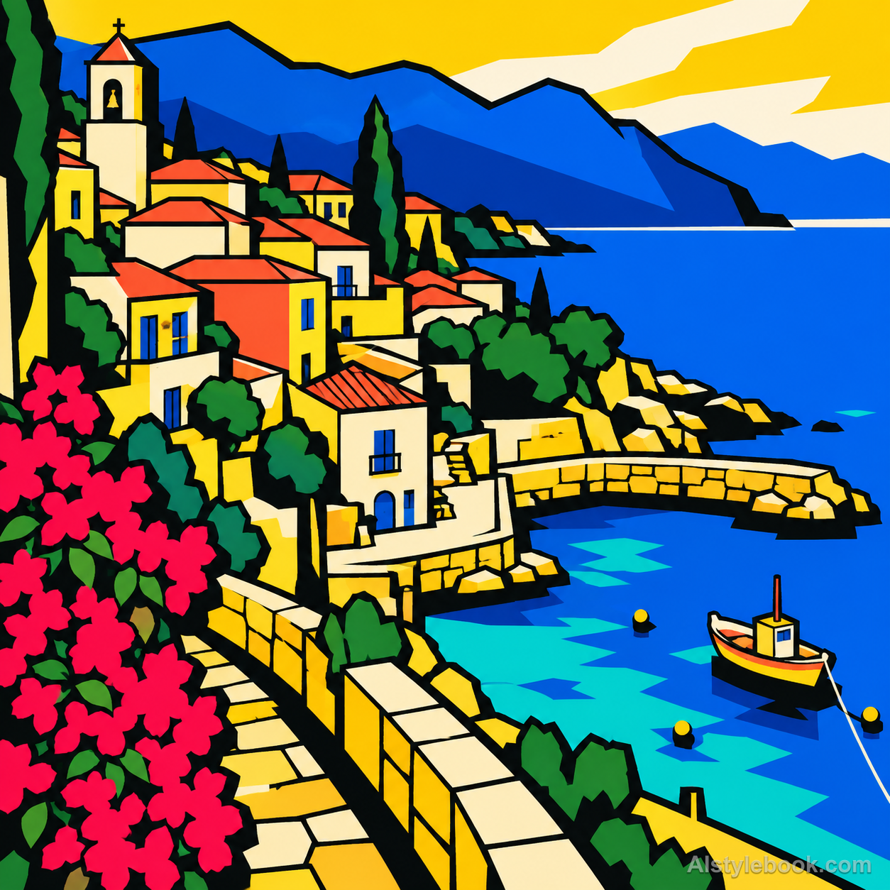
Heavy black outlines enclose bright solid fields, with local offset hard black shadows adding graphic weight.

The visual language
What is Neo-Brutalist Graphic?
A few forceful flat components describe the subject. Black backing shapes and high color contrast establish weight, while major turns and relative positions preserve identity instead of fine texture.
Neo-brutalist graphics use blunt contrast and intentionally direct component relationships as a contemporary treatment.
A bright yellow shape over a thick black offset mass can establish force with few elements.
How the style changes different subjects
- Portrait
- Heavy outlines and offset shadows divide face and clothing like flat pieces with dark backing.
- Landscape
- Clashing color planes and consistent shadows layer buildings and trees.
- Objects
- Thick edges and short hard shadows reduce curved objects to a few graphic shapes.
- Subjects
- Choose simple figures, buildings, cups or toys with room for bold outlines and displaced shadows.
Variant relationship
A heavy-outline and hard-shadow variant of Geometric Flat. Compare with Geometric Flat.
Geometric Flat relies on adjoining color fields and geometric divisions. This variant makes heavy black outlines, consistently offset hard shadows and bright color clashes structural, as if each flat component had a displaced black backing.
Bring the style to your photos
Reusable style prompt for Neo-Brutalist Graphic
Keep the source framing, identifying shapes and relative positions. Rebuild the entire image as bold neo-brutalist graphic illustration. Use a compact bright palette led by yellow, electric blue, coral and cream, allowing a few source-related accents, separated by very heavy continuous black contours. Give the principal existing shapes a consistent short offset black shadow down and right, with hard flat edges and no blur; treat these shadows as displaced graphic backings rather than realistic lighting. Simplify details into large readable geometric components and open negative spaces. Preserve the source subject instead of adding stickers or decorative symbols. Use flat opaque ink throughout, without gradients, halftones, distressed paper, realistic material shading, lettering or interface frames. Make hard offset shadow strips and blunt geometric contours the dominant graphic feature. Principal existing silhouettes have a clearly displaced solid-black duplicate down-right. Use a few large angular regions, entirely even color interiors and no individual blades of grass or fine photographic textures.Use the same style prompt for portraits, landscapes and objects.
Create with this styleKeep exploring


