
Illustration & Design
Pop Art Style
Style guide
Highly saturated solid colors, coarse halftone dots and slight misregistration create the direct, lively visual force of Pop Art.
The visual language
What is Pop Art Style?
Brilliant solid colors remap light and shadow, while coarse dots and shifted print layers add the immediacy of mass-media imagery. The recognizable silhouette matters more than fine detail.
Pop Art engages with consumer culture and reproduced images; bright color and dots are only some of its devices.
Repeating one can in contrasting colors shifts attention from material realism toward its identity as a sign.
How the style changes different subjects
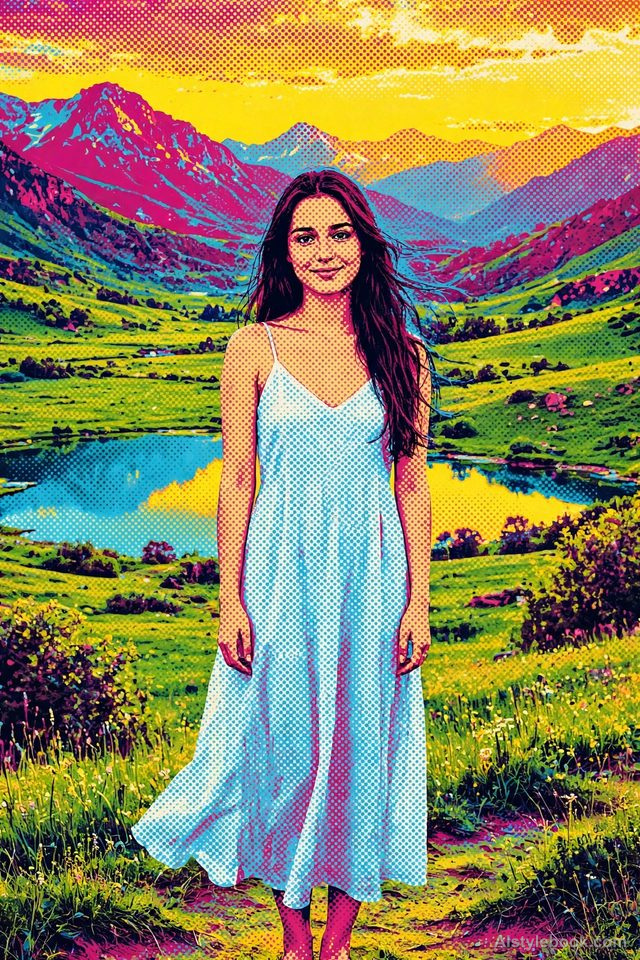
- Portrait
- Bold lines and bright colors amplify features and expressions; flat tones or dots replace skin shading.
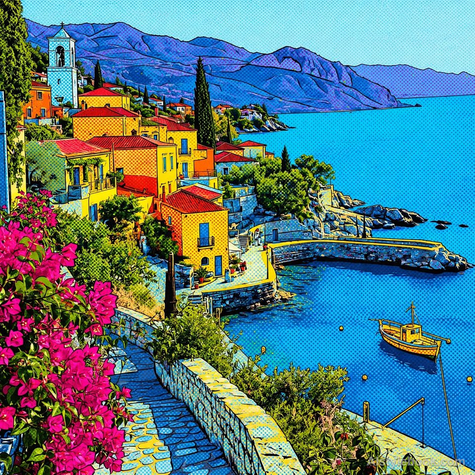
- Landscape
- Cities and landmarks become graphic forms separated by strong color, outlines and dot density.
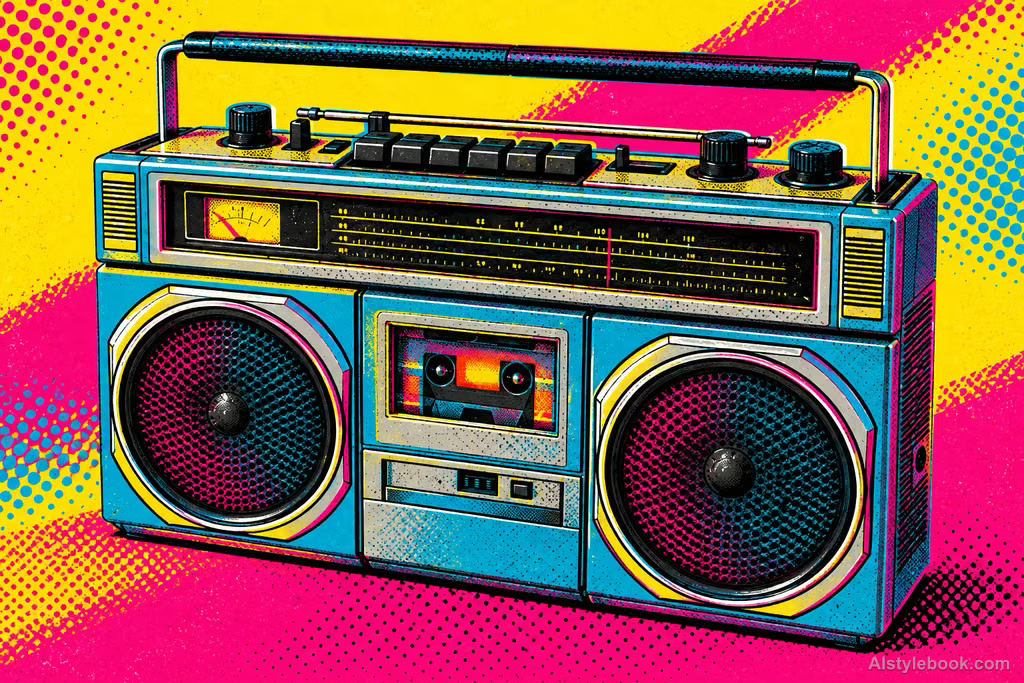
- Objects
- Everyday products gain striking silhouettes, simplified reflections and vivid printed color.
- Subjects
- Choose expressive portraits, packaged objects, toys or urban landmarks with clear outlines and large color areas.
Popular imagery in art
Pop Art brought consumer goods, mass media and popular culture into art while crossing painting, photography and printmaking.
Bring the style to your photos
Reusable style prompt for Pop Art Style
Distill the subject into striking flat contours, redistributing light and shade through highly saturated solid colors and strong warm-cool contrast. Add coarse halftone dots and overlapping screen-printed layers in selected areas. Keep boundaries clear, ink grain visible, and registration slightly imperfect. Make the core form distinctly recognizable. Convey vivid popular-image energy through bold color and the tension of a single graphic composition.Use the same style prompt for portraits, landscapes and objects.
Create with this styleKeep exploring


