
Printmaking & Printing
Smooth-Cut Linocut
Style guide
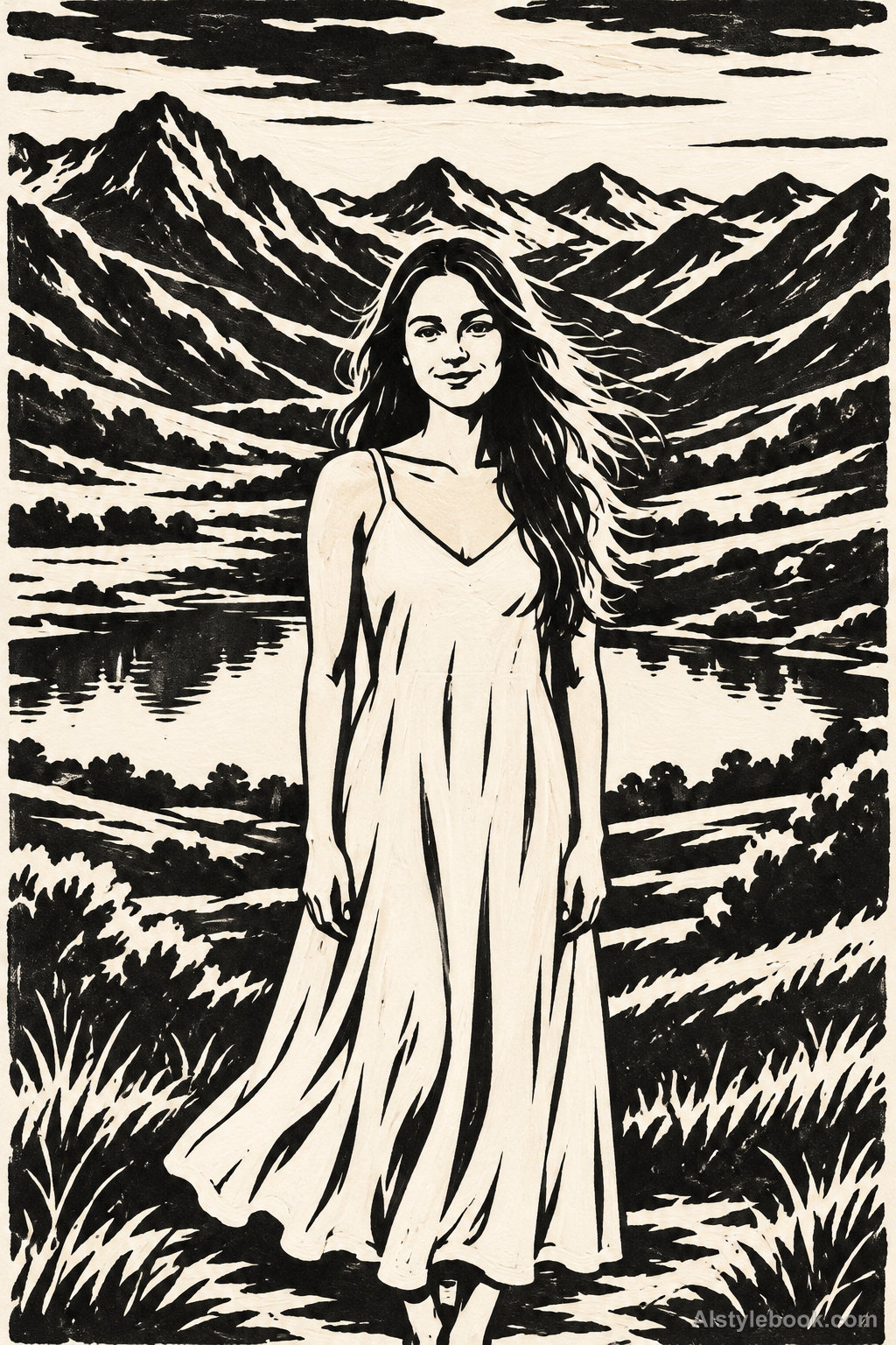
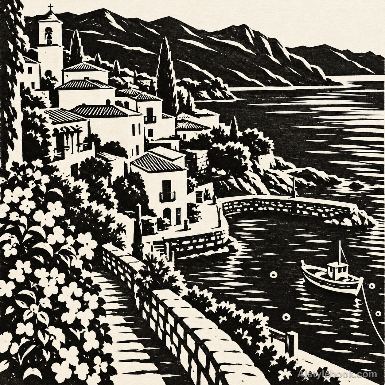
Broad black ink fields are opened by smooth curved white cuts, with a clean block surface and a few printing gaps.

The visual language
What is Smooth-Cut Linocut?
Large quiet black areas carry weight while white gouge channels turn around the forms. A few broad cuts describe folds, hair and water; small printing gaps preserve the slight unevenness of a hand-pulled impression.
Smooth linocut emphasizes clean relief shapes and flowing cuts without relying on wood grain.
A dark hair mass opened by a few wide curved channels can feel economical and decisively printed.
How the style changes different subjects
- Portrait
- Black-white cuts simplify features, hair and folds into forceful contours and expressions.
- Landscape
- Carved lines and solid ink separate trees, rocks and buildings with directional texture.
- Objects
- White cuts replace reflections while black fields and gouges describe volume.
- Subjects
- Choose side-lit figures, trees, rocks or distinct objects with strong tonal contrast.
Variant relationship
A linoleum-material variant of relief printing. Compare with Woodcut Print.
The comparison style is Woodcut Print. Both build relief-printed forms from ink and reserved paper. This linoleum variant removes wood grain and dense cross-cutting in favor of cleaner black fields, smoothly turning broad gouges and larger white cuts. Linoleum and wood are different block materials.
Bring the style to your photos
Reusable style prompt for Smooth-Cut Linocut
Keep the source layout, silhouettes and defining internal features. Translate the whole picture into a two-tone hand-pulled linocut: rich matte black ink on warm white paper. Use broad solid black regions opened by a limited number of confident curved U-gouge cuts, blunt tapered wedges and smooth long contour channels. Make cuts turn fluidly around volume; leave generous uncut ink areas and large reserved-white shapes. Retain small natural print gaps at a few edges while keeping most ink fields flat and dense. Distinguish this from woodcut through absence of wood grain, splintered edges, dense crosshatching and many tiny scratch lines. Avoid gray washes, colored ink, vector-perfect regularity, stencil overspray and added ornament. Use unusually broad curved gouge channels, conspicuous white comma-shaped cuts and large quiet black islands. Simplify aggressively rather than tracing photographic microdetail. Make the carving gesture visible in hair, fabric and terrain. No tiny vegetation silhouettes, scratch hatch, dust specks or spray-cut stencils.Use the same style prompt for portraits, landscapes and objects.
Create with this styleKeep exploring


