
Illustration & Design
Watercolor Journal Poster
Style guide
Lively pen contours and loose transparent washes create an uncluttered travel-journal observation.

PortraitStyle effect
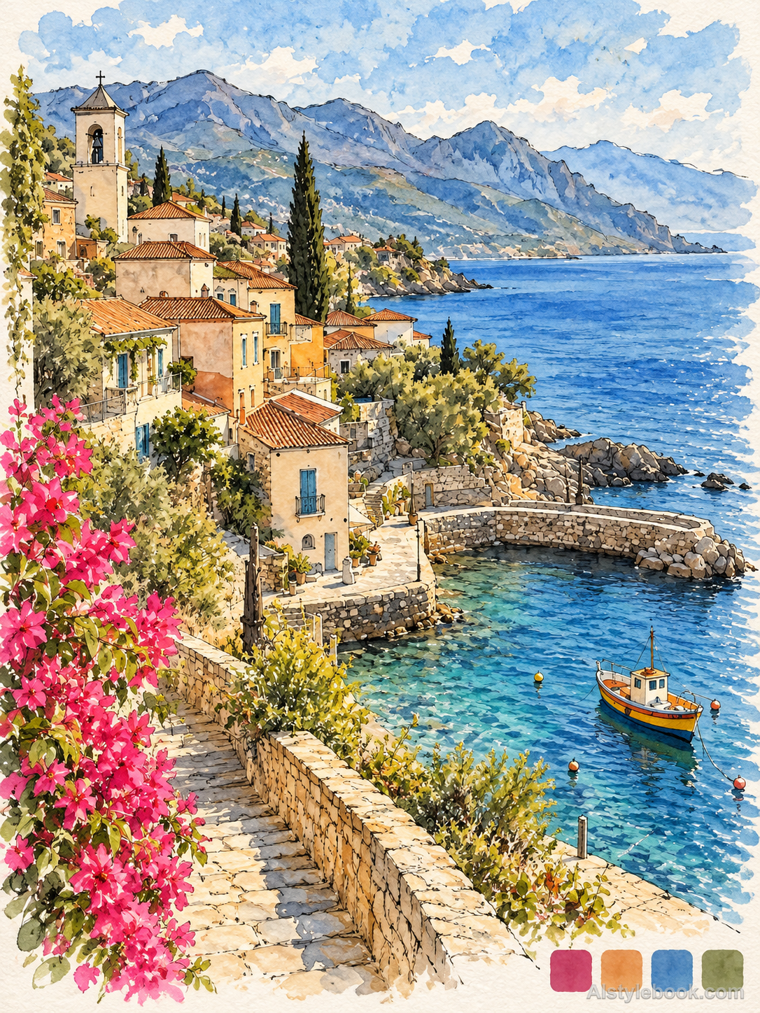
LandscapeStyle effect
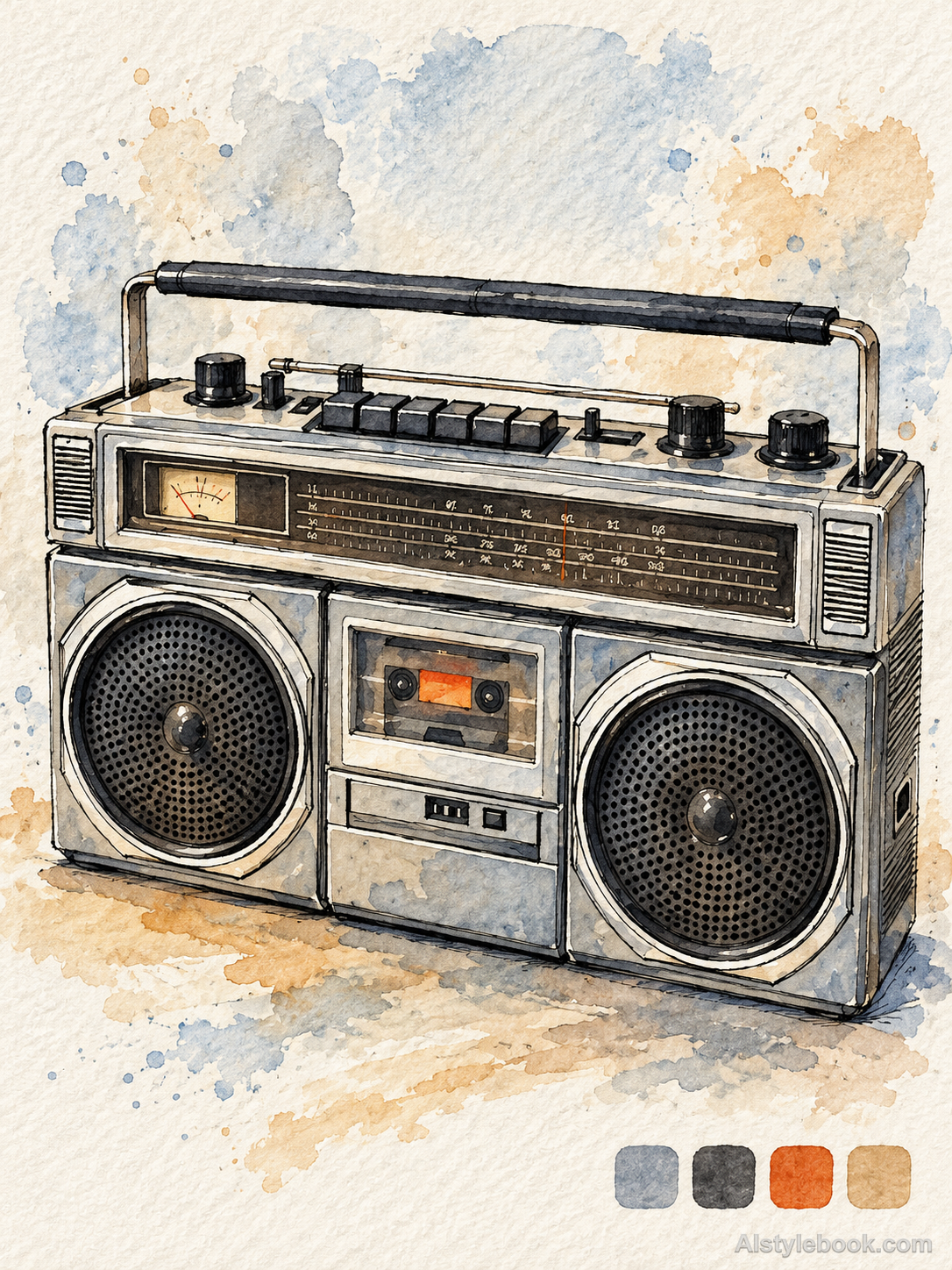
ObjectsStyle effect
The visual language
What is Watercolor Journal Poster?
Fine pen catches observed contours while muted washes can wander beyond them. Subject and setting remain one relaxed visual record, with paper white separating the details.
Pen-and-wash journals let observed contours coexist with small wash irregularities.
Two fine lamp-post strokes and warm color spreading beyond the shade can feel like a page recorded during a walk.
How the style changes different subjects
- Portrait
- Sketch marks preserve the pose while light washes indicate skin and clothing without elaborate finishing.
- Landscape
- Drawn buildings and landmarks anchor the view; washes add weather and light like a travel observation.
- Objects
- Contours, shadows and a little color explain volume while open paper keeps the study informal.
- Subjects
- Choose street corners, travel portraits, coffee cups or personal objects with clear contours and a few focal details.
Bring the style to your photos
Reusable style prompt for Watercolor Journal Poster
Redraw the entire image in pen-and-wash travel-journal language. Lively fine black lines describe observational contours, while transparent low-saturation watercolor spreads loosely and irregular wet edges dissolve into textured paper. Keep the subjects and setting part of one drawn structure. Small source-derived color patches may provide quiet palette cues. Use spacious paper white and relaxed marks for a clear, uncluttered visual record.Use the same style prompt for portraits, landscapes and objects.
Create with this styleKeep exploring


