
Pixels & Characters
Braille Dot Art
Style guide
Tiny circular dots occupy strict two-column, four-row cells, building tone from discrete dot patterns.
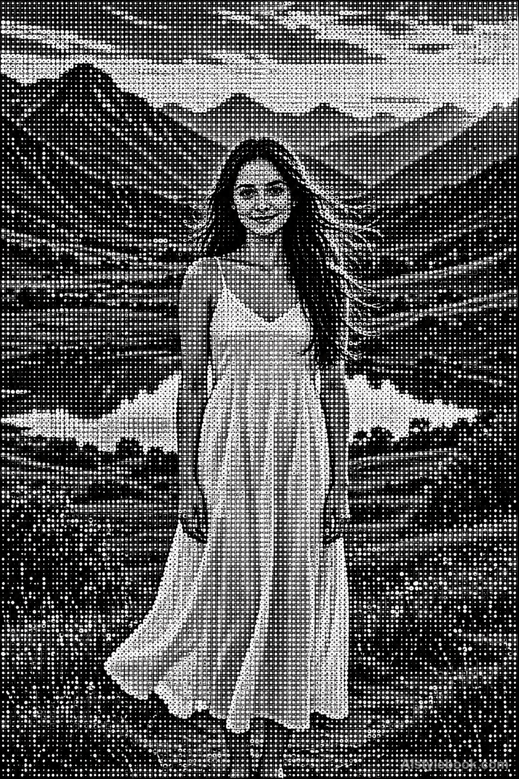
PortraitStyle effect

LandscapeStyle effect
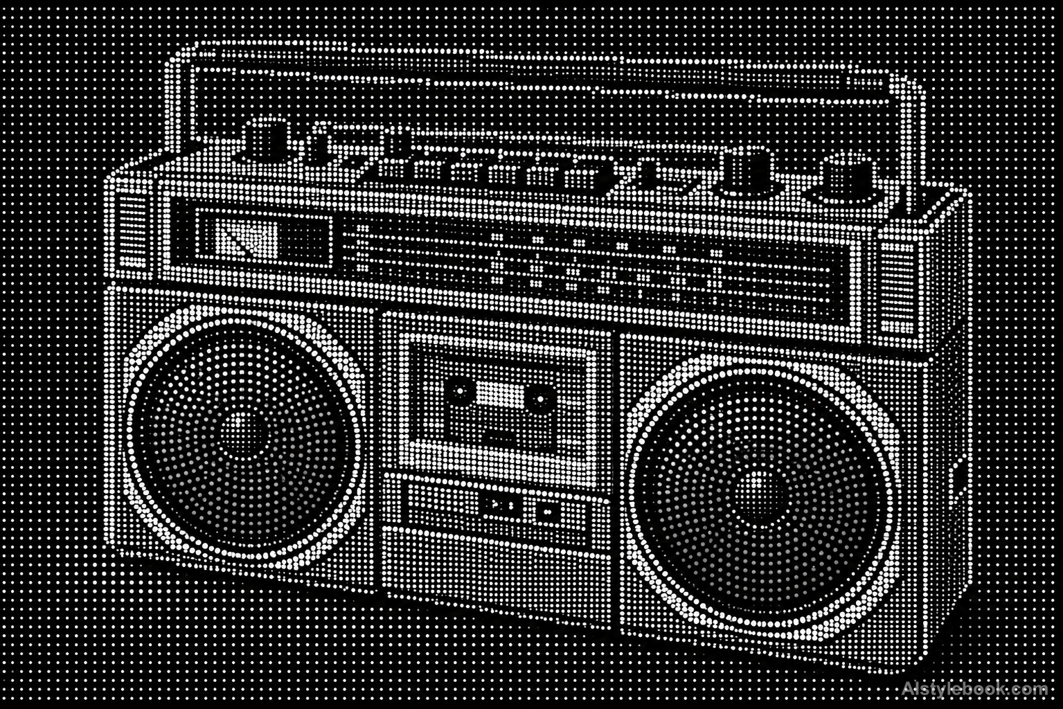
ObjectsStyle effect
The visual language
What is Braille Dot Art?
This visual treatment uses two-column, four-row Braille cells to encode an image. It is pictorial dot art rather than readable Braille text. Tight spacing inside each cell and wider gaps between cells produce a distinctive rhythm along contours and tonal transitions.
Braille-pattern art uses fixed dot positions as visual units rather than readable language.
Separated two-column clusters can merge into foliage at a distance without constituting accessible written text.
How the style changes different subjects
- Portrait
- Fixed dots or glyph units sample facial tones into regular density changes.
- Landscape
- Consistently spaced units turn scenery into clear outlines with abstracted texture.
- Objects
- Unit size or coverage models curves as an ordered tonal field.
- Subjects
- Choose large portraits, buildings, flowers or single still lifes with broad tonal areas readable at a distance.
Bring the style to your photos
Reusable style prompt for Braille Dot Art
Rebuild the image as dense monochrome Unicode Braille cell art. Every character cell contains exactly two possible dot columns and four possible dot rows, with consistent small circular dots and visibly larger gaps between neighboring cells. Use occupied and empty dot positions to express all contours and tones against a clean dark background. Maintain the same cell scale throughout, preserving recognizable broad forms while reducing fine detail to dot resolution. Use no letters, random stippling, continuous outlines or hidden photographic layer.Use the same style prompt for portraits, landscapes and objects.
Create with this styleKeep exploring


