
Painting & Drawing
Stipple Ink
Style guide
Separate fine black dots model light and shade through organic density on white paper, producing subtle layers and a patient handmade rhythm.

PortraitStyle effect
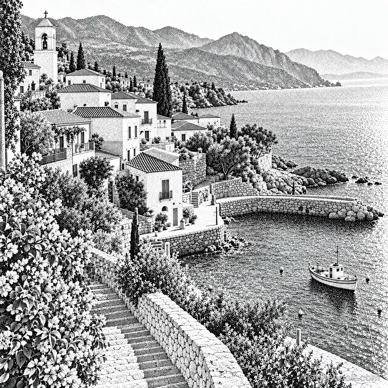
LandscapeStyle effect

ObjectsStyle effect
The visual language
What is Stipple Ink?
Countless separate black dots use changing spacing to build continuous tone, with white paper visible between marks. Clusters follow the structure and reveal a patient rhythm up close.
Ink stippling builds tone through the spacing of solid dots.
Dense marks on a pear's shaded side and sparse marks toward its highlight can produce volume without a continuous gray wash.
How the style changes different subjects
- Portrait
- Dot spacing builds skin tones or grayscale; fragmented marks resolve into a face at viewing distance.
- Landscape
- Canopies, sky and ground become dot fields whose broad tonal structure outweighs fine detail.
- Objects
- Changing dot density describes curves, with clear edges and reserved highlights.
- Subjects
- Choose side-lit portraits, trees, flowers, fruit or simple still lifes large enough to retain recognizable features.
Bring the style to your photos
Reusable style prompt for Stipple Ink
Rebuild the subject with fine black pen stippling on white paper. Keep circular dots separate and organically spaced rather than arranged as a regular halftone screen. Control dot density precisely to create continuous tonal depth: sparse dots and bare paper for highlights, dense clusters for deep shadows, and natural, clear edges. Preserve a patient, meticulous handmade rhythm and recognizable space. Avoid hatching, brushwork, photographic gray layers, and continuous airbrushed shading.Use the same style prompt for portraits, landscapes and objects.
Create with this styleKeep exploring


