
Illustration & Design
Calligram Word Art Poster
Style guide
Legible letterforms themselves build contours, volume and shadow through size, rotation and spacing.
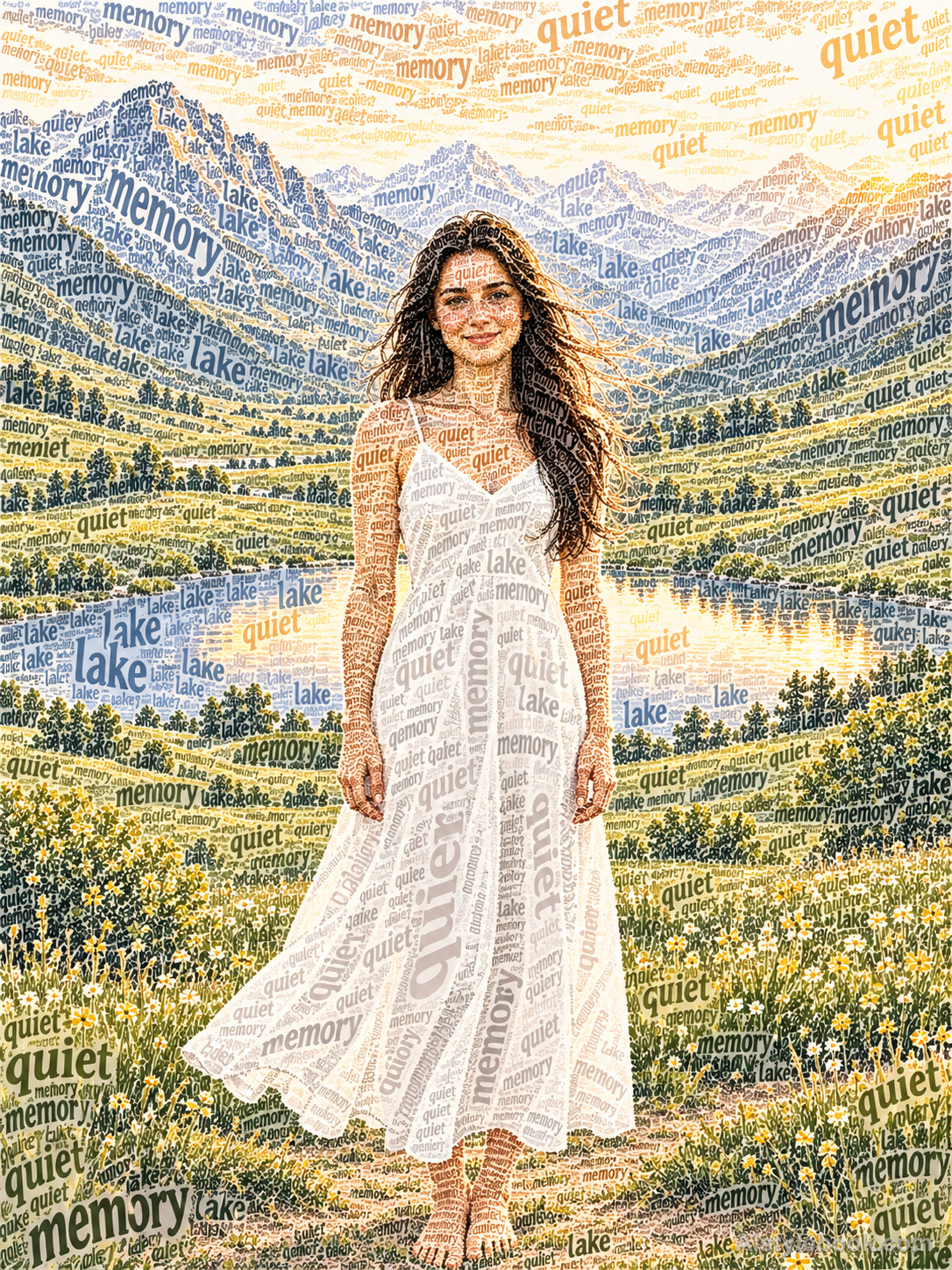
PortraitStyle effect
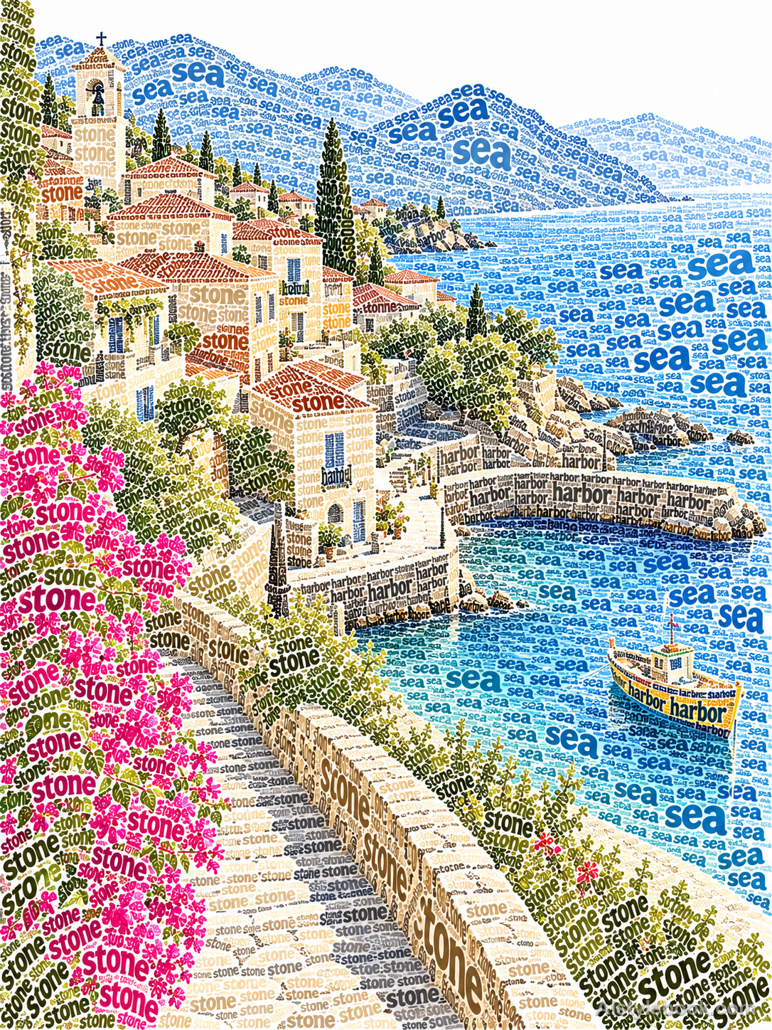
LandscapeStyle effect

ObjectsStyle effect
The visual language
What is Calligram Word Art Poster?
Letterforms construct the image itself: larger glyphs establish edges while smaller dense ones build shadow. Rotation and spacing carry the forms, with negative space separating them.
Calligram posters use letter size, weight and spacing as image-making tools.
Large words forming peaks and small dense ones forming valleys can reveal a landscape before its language becomes readable.
How the style changes different subjects
- Portrait
- Text density builds face and hair, simplifying small features into a silhouette readable at a distance.
- Landscape
- Ridges, trees and buildings guide the flow of words; density organizes depth.
- Objects
- Text direction and scale describe curved objects, with gaps supplying highlights.
- Subjects
- Choose profiles, trees, bottles or distinctive objects against simple backgrounds so text and overall shape can coexist.
Bring the style to your photos
Reusable style prompt for Calligram Word Art Poster
Construct the subjects' contours, internal details, highlights and shadows entirely from legible letterforms. Arrange larger glyphs along defining edges and gather smaller, denser ones in shadow, using rotation, scale and spacing to model volume. Choose the lettering from the original image's theme or text specified by the user. Retain broad paper-white areas and clear negative space, making the image emerge directly from coherent typographic construction.Use the same style prompt for portraits, landscapes and objects.
Create with this styleKeep exploring


