
Printmaking & Printing
CMYK Halftone
Style guide
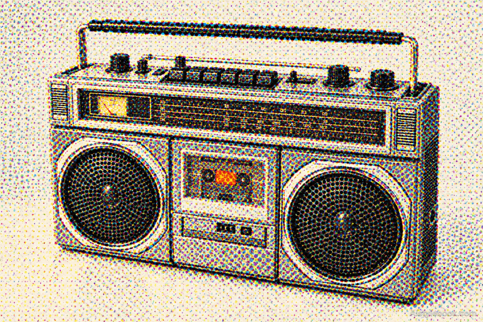
Cyan, magenta, yellow and black dot separations overlap into a tactile four-color print.


The visual language
What is CMYK Halftone?
CMYK halftone separates continuous color into four ink layers that overlap at different screen angles. Dot sizes and transparent ink overlaps work together to reconstruct color. Paper gaps, fine rosettes and small registration shifts keep the printing structure visible.
CMYK halftone coordinates four screened ink channels and their overlaps.
An orange petal resolving into magenta and yellow dots, with black added in shadow, makes its printed color construction visible.
How the style changes different subjects
- Portrait
- Regular dots or lines break skin and clothing gradients into a visible screen that resolves at a distance.
- Landscape
- Screen coverage separates sky, plants and buildings with a printed rhythm.
- Objects
- Dot or line area controls highlights and curves, potentially merging small text and reflections.
- Subjects
- Choose close portraits, products, buildings or well-lit landscapes with varied tones for the screen to reproduce.
Early foundations in multi-plate color
Four-color halftones have a longer background in printing separate color plates. RISD Museum describes Jacob Christof Le Blon presenting the principles of overlapping differently colored copperplates in his 1725 Coloritto. This early work supplies historical context for separation and registration; modern CMYK screens render continuous color with four process inks and dot structures.
Artists & practitioners
Creators to know
Jacob Christof Le Blon
An early investigator of multi-plate color printing whose 1725 Coloritto discussed extending color through a small set of overlapping separations.
Bring the style to your photos
Reusable style prompt for CMYK Halftone
Translate the complete image into a visible four-color process halftone print on white paper. Separate values into cyan, magenta, yellow and black ink dots using consistent screen frequencies and distinct screen angles. Let transparent dot overlaps form secondary colors, retain paper-white gaps in highlights and gather larger dots in shadows. Add slight registration drift at a few edges and restrained porous ink texture. Preserve the original composition and color hierarchy without spot-color substitution, smooth digital shading or black contour outlines.Use the same style prompt for portraits, landscapes and objects.
Create with this styleKeep exploring


