
Printmaking & Printing
Risograph
Style guide
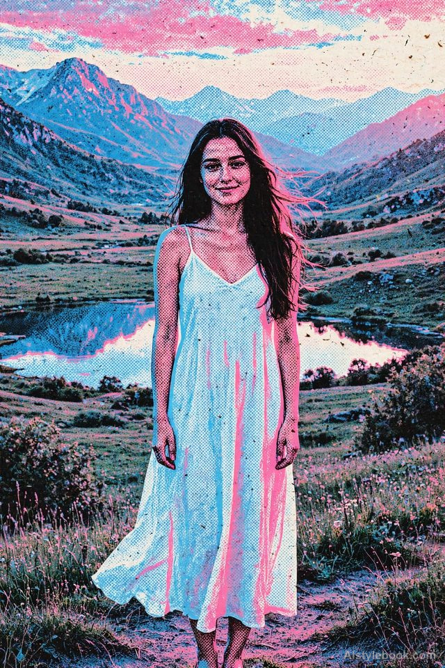
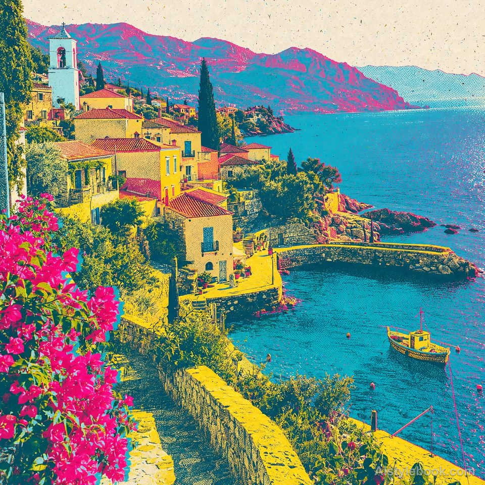
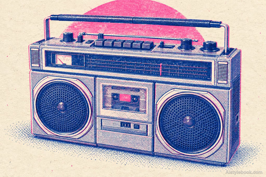
Overprinted spot colors, varied halftone dots and slight misregistration combine into a lively independent-print texture.
The visual language
What is Risograph?
A few transparent spot inks overlap into new colors, while dots and grain expose the printed layers. Slight misregistration gives edges the energy of independent publishing.
Separate stencil layers make overlapping transparent inks readable as additional colors.
Imagine blue leaves crossing pink petals: their overlap forms another hue while small gaps keep the paper visible.
How the style changes different subjects
- Portrait
- Limited printed colors unify skin and clothing with grain, drawn marks or overprinted edges.
- Landscape
- Separable color layers emphasize broad skies and architectural shapes.
- Objects
- Printed color and bare paper replace reflections, adding ink texture and simplifying small lettering.
- Subjects
- Choose clear figures, buildings, flowers, fruit or simple products recognizable in a limited palette.
Origins in duplicating equipment
RISO launched the first RISOGRAPH products in 1980. This stencil-based equipment originally served fast, high-volume printing in schools and offices.
Bring the style to your photos
Reusable style prompt for Risograph
Use a few vivid spot-color separations in a Risograph print, allowing transparent overlapping inks to produce additional mixed colors. Organize light and shade through visible halftone dots and grain density. Preserve paper fibers, locally uneven ink coverage, and slight misregistration at color boundaries. Distill details graphically for the rough vitality of independent publishing. Keep the palette lively and cohesive, avoiding smooth photographic gradients.Use the same style prompt for portraits, landscapes and objects.
Create with this styleKeep exploring


