
Photography & Film
Infrared
Style guide
Material-response differences become milky white, pale pink and cool dark contrast, preserving photographic detail with unfamiliar, translucent color.

PortraitStyle effect
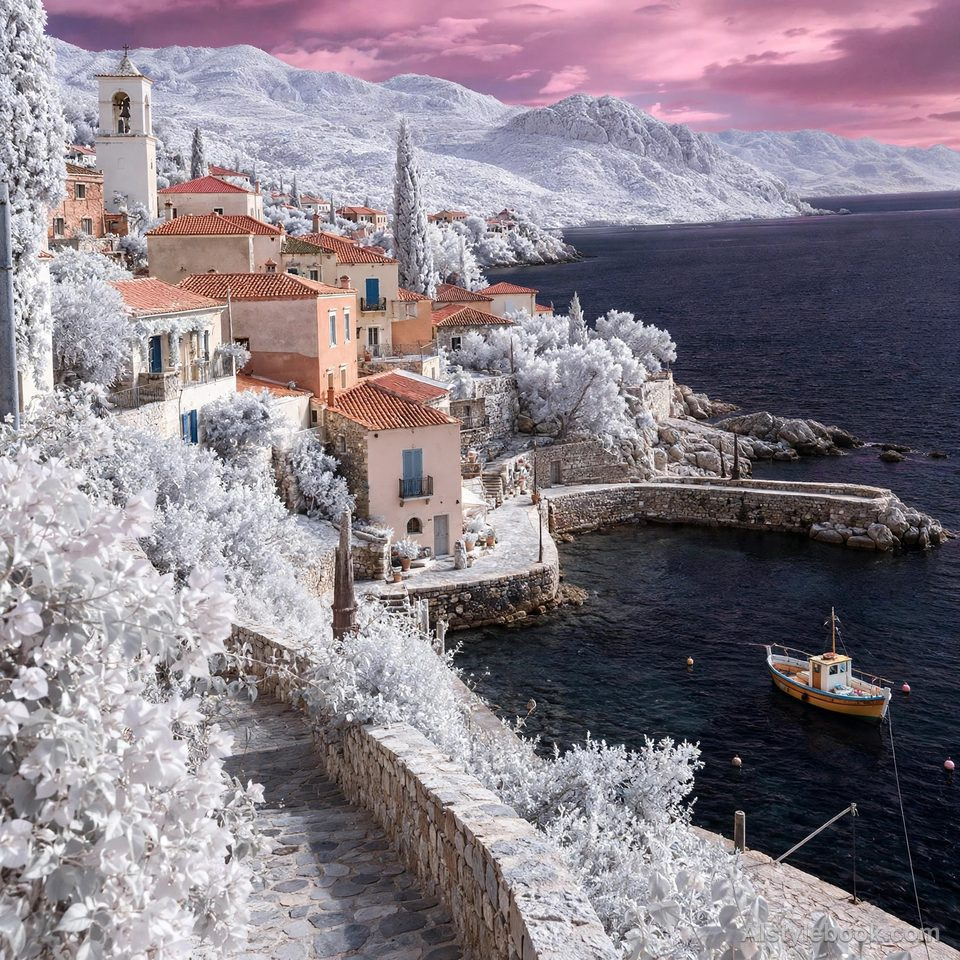
LandscapeStyle effect
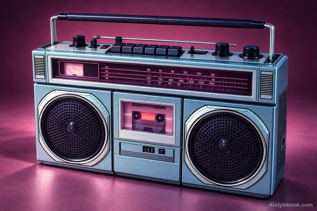
ObjectsStyle effect
The visual language
What is Infrared?
Material responses are remapped into milky white, pale pink and cool dark regions, moving away from everyday color. Photographic detail stays clear, so unfamiliarity comes from tonal relationships rather than blur.
Near-infrared imagery records reflected wavelengths, so pale foliage is not a temperature measurement.
White leaves beneath a dark sky can make a clearly detailed park feel unfamiliar.
How the style changes different subjects
- Portrait
- Skin and clothing shift away from everyday color, often changing the tonal contrast between the figure and foliage.
- Landscape
- The brightness relationships of vegetation, sky and water are rearranged, making familiar places feel unfamiliar.
- Objects
- Original color becomes less useful as a material cue; shape and reflection carry more of the recognition.
- Subjects
- Choose scenes combining trees and water, portraits among foliage, or objects with clear tonal regions to make the shift easy to see.
Bring the style to your photos
Reusable style prompt for Infrared
Simulate the unfamiliar quality of near-infrared imaging and false-color mapping. Give different materials distinct brightness and color responses according to reflectance. Highly reflective areas may become luminous milky white or pale pink, while low-response areas stay deep with clearly defined shadows, creating subtle pink-purple and cool-dark contrast. Preserve realistic lighting, material boundaries, and photographic detail. Avoid uniformly tinting the entire image or indiscriminately bleaching surfaces.Use the same style prompt for portraits, landscapes and objects.
Create with this styleKeep exploring


