
Photography & Film
Thermal Imaging Interpretation
Style guide
Broad apparent-heat regions from blue-violet to orange-red and yellow-white reorganize form with soft transitions, low texture and clear boundaries.
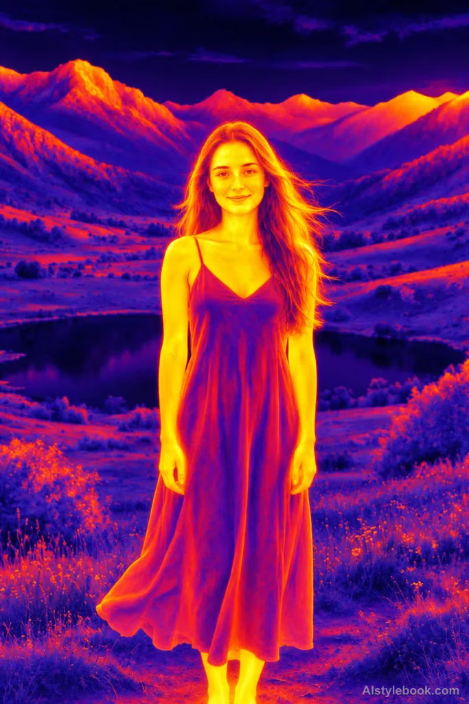
PortraitStyle effect
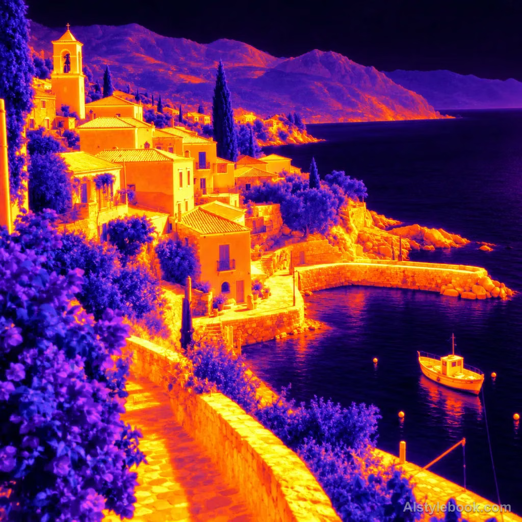
LandscapeStyle effect
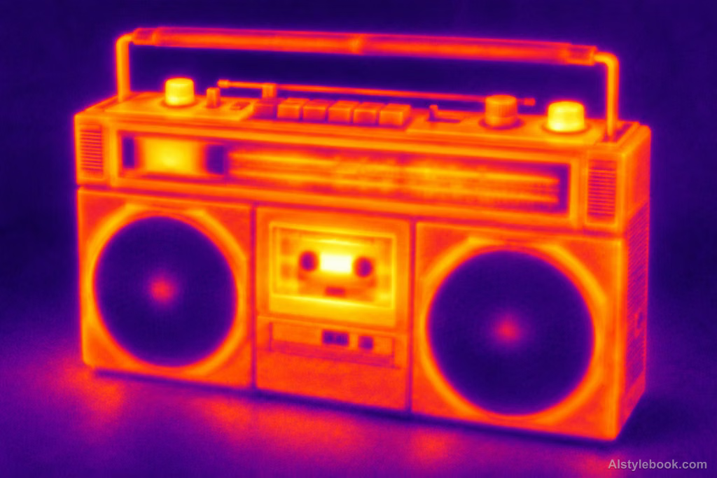
ObjectsStyle effect
The visual language
What is Thermal Imaging Interpretation?
Broad regions move from blue-violet through orange-red to yellow-white, replacing visible-light texture. Thermal-imaging color shapes the form, but apparent heat zones do not represent measured temperature.
Thermal cameras visualize infrared radiation through a chosen palette, distinct from visible surface color.
An orange figure against blue-purple surroundings can evoke heat distribution without supplying actual temperature data.
How the style changes different subjects
- Portrait
- Directional colors, false color or bright edge grain replace natural tones, leaving shapes and regions to identify the face.
- Landscape
- Rule-based color fields give scenery a technical-visualization appearance rather than natural lighting.
- Objects
- Structural color regions and bright edges replace much of the original material and hue.
- Subjects
- Choose geometric buildings, sculptures, equipment or clear figures whose curves, corners and tonal boundaries separate the color regions.
Bring the style to your photos
Reusable style prompt for Thermal Imaging Interpretation
Reorganize the image through an artistic thermal-imaging language, replacing surface detail with broad, softly blended apparent-heat regions. Use near-black violet and blue-purple for cool areas, orange-red for warmer areas and yellow-white for the brightest zones, applying the palette consistently according to form. Reduce surface texture while retaining clear structural boundaries, faint sensor noise and soft transitions so the image arises from heat-field organization rather than visible-light color.Use the same style prompt for portraits, landscapes and objects.
Create with this styleKeep exploring


