
Painting & Drawing
Japanese Minimal Watercolor
Style guide
A small luminous watercolor merges into broad warm-white paper, with slight watermarks and dissolving edges creating quiet restraint.
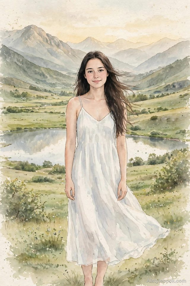
PortraitStyle effect
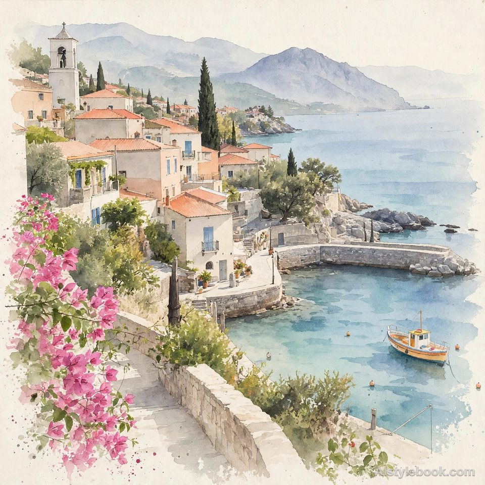
LandscapeStyle effect
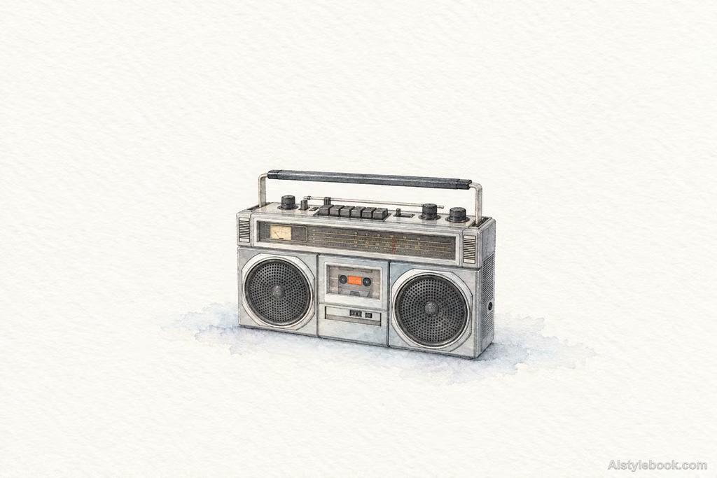
ObjectsStyle effect
The visual language
What is Japanese Minimal Watercolor?
Pale transparent color appears only at essential points, with soft edges and clean paper white describing the forms together. Asymmetric spacing creates a quiet, open rhythm.
This contemporary label describes restraint in color and spacing rather than one historical school.
A flower can feel complete with one warm center, a few pale leaves and carefully balanced paper space.
How the style changes different subjects
- Portrait
- A few lines and pale washes describe the face, reducing clothing detail and emphasizing surrounding space.
- Landscape
- Sparse marks describe trees, hills and houses; blank paper becomes mist, water or sky.
- Objects
- Minimal outlines and washes favor shape and spacing over surface texture.
- Subjects
- Choose a single plant stem, lone tree, tea vessel or simple profile against an uncluttered background.
Bring the style to your photos
Reusable style prompt for Japanese Minimal Watercolor
Distill the subject into a small, complete visual focus in Japanese minimalist watercolor, set on a broad field of warm-white, finely textured watercolor paper. Keep colors high in value, low in saturation, and transparent. Thin layered washes should preserve tide marks, paper grain, and naturally dissolving edges, optionally supported by a few light pencil or fine pen lines. Remove elaborate detail while retaining principal spatial relationships. Balance open margins and faint color echoes, treating negative space as equal to form.Use the same style prompt for portraits, landscapes and objects.
Create with this styleKeep exploring


