
Painting & Drawing
Oil Pastel
Style guide
Heavy oily-wax color bands overlap and rub together, with broken dragged edges and scraped ground creating a dense tactile surface.
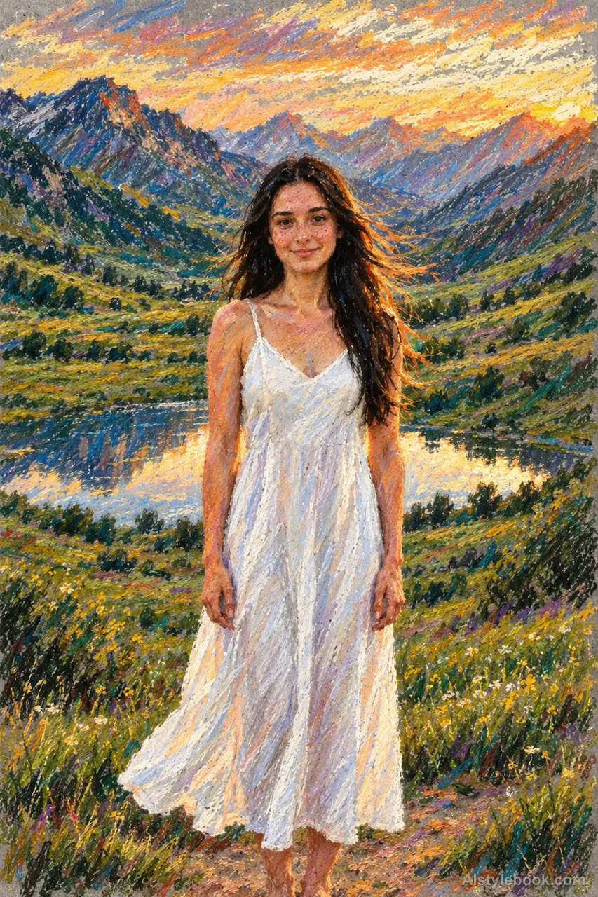
PortraitStyle effect
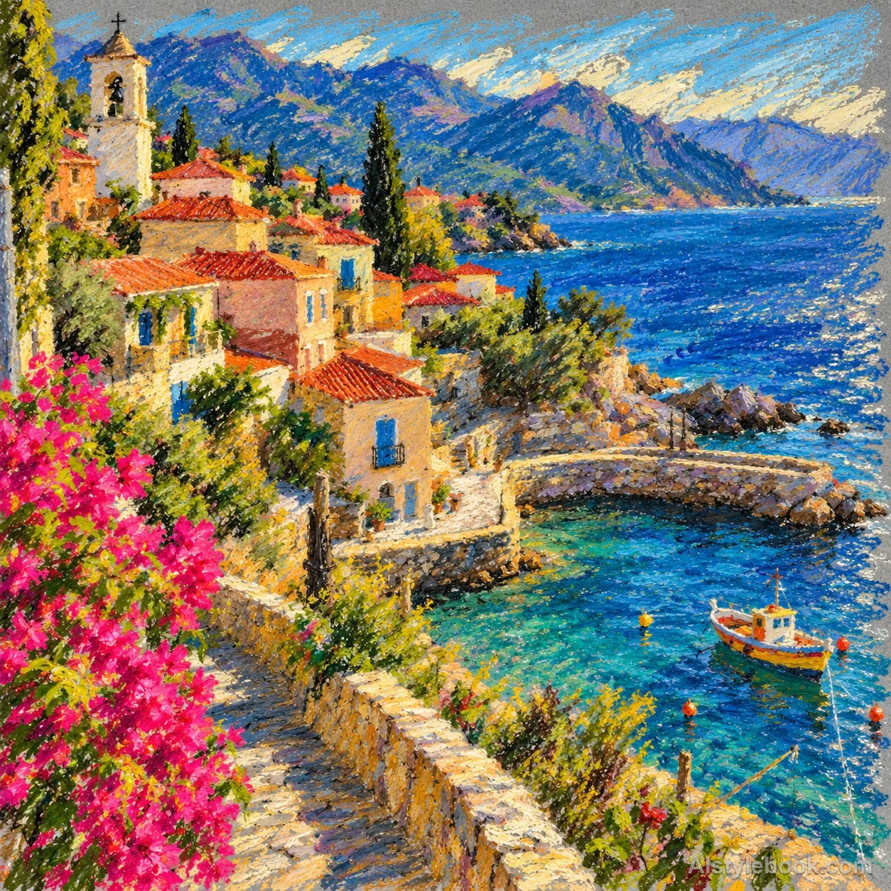
LandscapeStyle effect
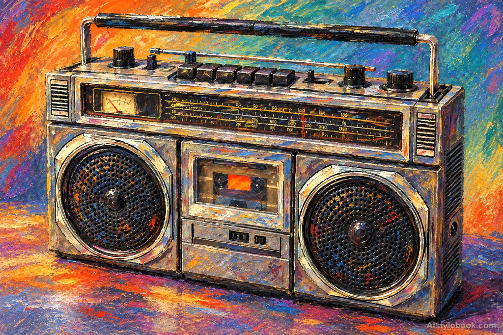
ObjectsStyle effect
The visual language
What is Oil Pastel?
Oily wax sticks rub repeatedly across the paper, thickening where color bands overlap. Dragged breaks, scratched undercolor and directly meeting hues retain a strong tactile quality.
Oil pastel's oily, waxy binder produces substantial layered marks rather than loose powder.
A yellow stroke pressed over blue can retain both colors at its edge, with scratching revealing the layer below.
How the style changes different subjects
- Portrait
- Soft rubbing and layered color model skin and fabric, with broken edges adding warmth and tactility.
- Landscape
- Sky and mist merge into gentle color layers while trees and ground retain directional marks.
- Objects
- Soft color wraps surfaces; paper texture or waxy marks lend smooth objects a tactile finish.
- Subjects
- Choose softly lit portraits, flowers, fruit or evening landscapes with varied middle tones.
Bring the style to your photos
Reusable style prompt for Oil Pastel
Draw the image in oil pastel. Establish volume with blunt thick color strokes, overlapping oily-wax deposits and smears following the forms; retain ragged broken edges where the pastel drags. Mix colors directly on the paper, pressing saturated darks into shadows and preserving moist-looking reflections on pale wax highlights. Scratch selected passages back to undercolor. Follow the original color structure with dense, greasy, directional marks.Use the same style prompt for portraits, landscapes and objects.
Create with this styleKeep exploring


