
Illustration & Design
Painterly Travel Journal
Style guide
Softly substantial opaque strokes, broken edges and layered warm orange and cyan-blue create a warm, relaxed painterly-journal texture.
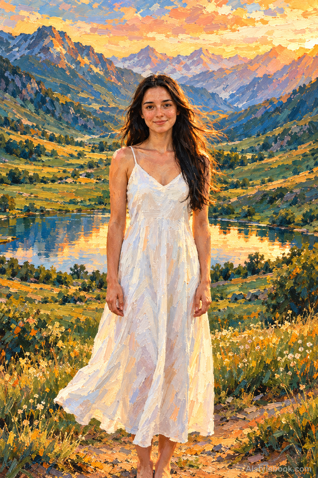
PortraitStyle effect
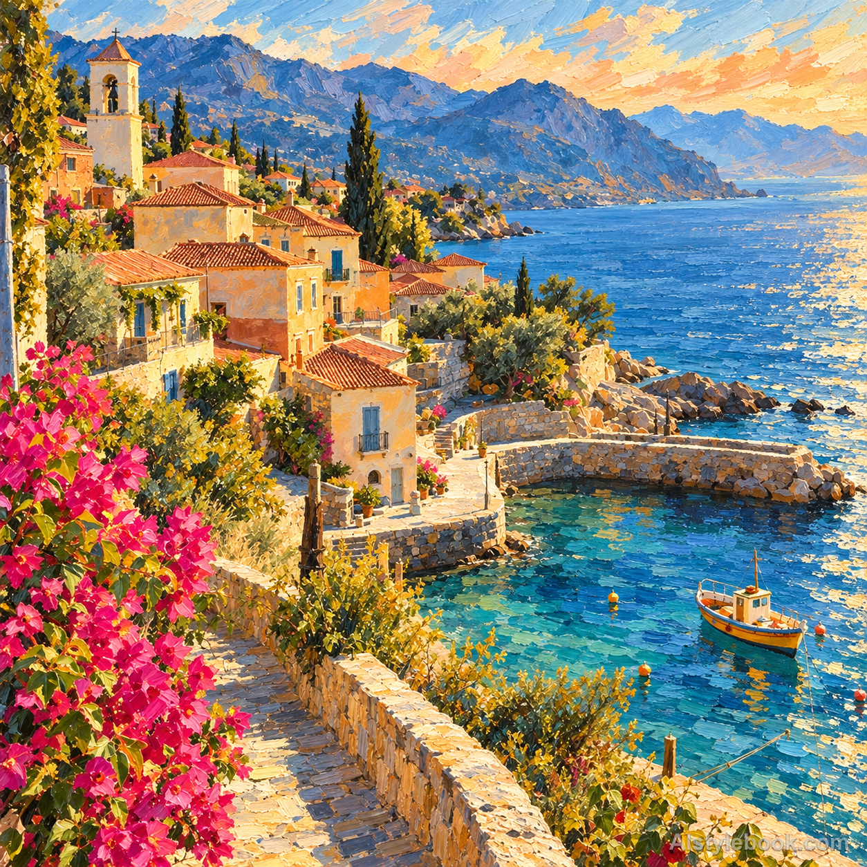
LandscapeStyle effect
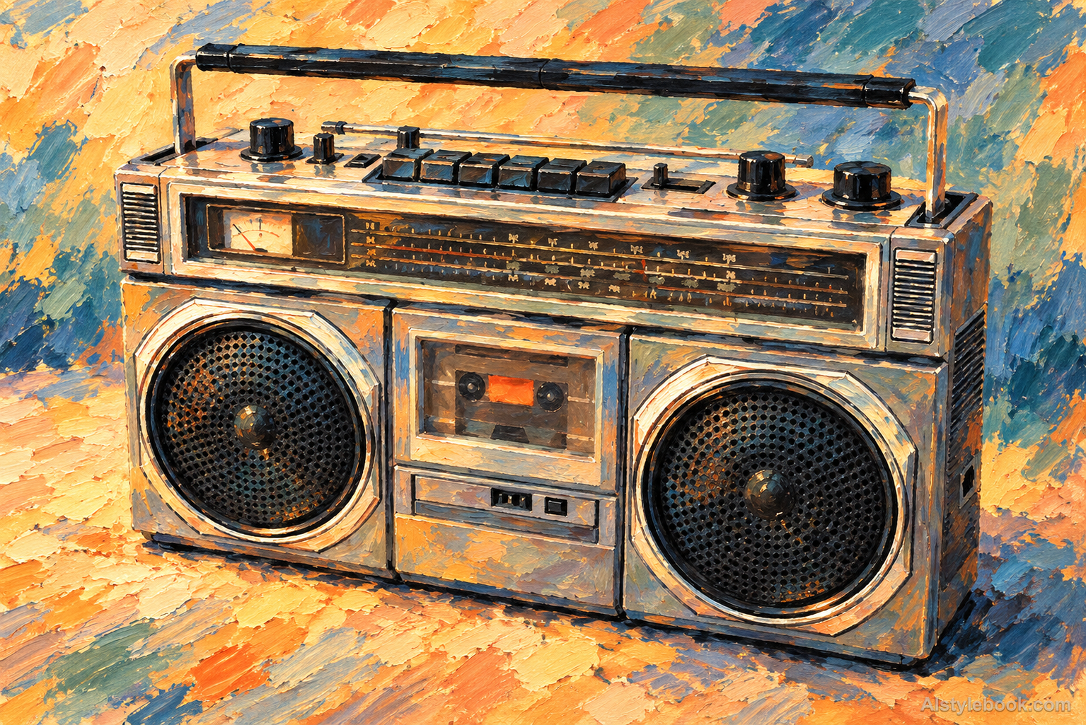
ObjectsStyle effect
The visual language
What is Painterly Travel Journal?
Softly substantial opaque marks build color along the forms, with locally broken edges. Warm orange-gold and cyan-blue layers overlap, making the travel scene feel freshly painted.
A painterly travel journal selects memorable light and color relationships rather than every detail.
Warm orange sunlight beside two blue shadow strokes can make a street feel freshly observed.
How the style changes different subjects
- Portrait
- Opaque color planes simplify face and clothing, with visible brush edges giving the portrait a painted quality.
- Landscape
- Adjacent color masses build scenery, clarifying warm-cool relationships while simplifying detail.
- Objects
- A few bright shapes replace reflections; brush marks connect curved surfaces and shadows into a matte finish.
- Subjects
- Choose streets, fruit, flowers, colored vessels or clearly lit figures with well-separated color masses.
Bring the style to your photos
Reusable style prompt for Painterly Travel Journal
Redraw the entire image as a warm painterly travel journal. Use visible, softly substantial opaque brushstrokes, gently broken edges and layered color to model the subjects. Balance warm orange and golden highlights with clear cyan-blue and teal passages while keeping original colors recognizable. Give every region purposeful painted marks that describe form and texture, combining the relaxed immediacy of a visual record with coherent layered painting.Use the same style prompt for portraits, landscapes and objects.
Create with this styleKeep exploring


