
Pixels & Characters
Cross-Glyph Screen
Style guide
Discrete plus and cross glyphs shape the image through scale and density within a crisp grid.
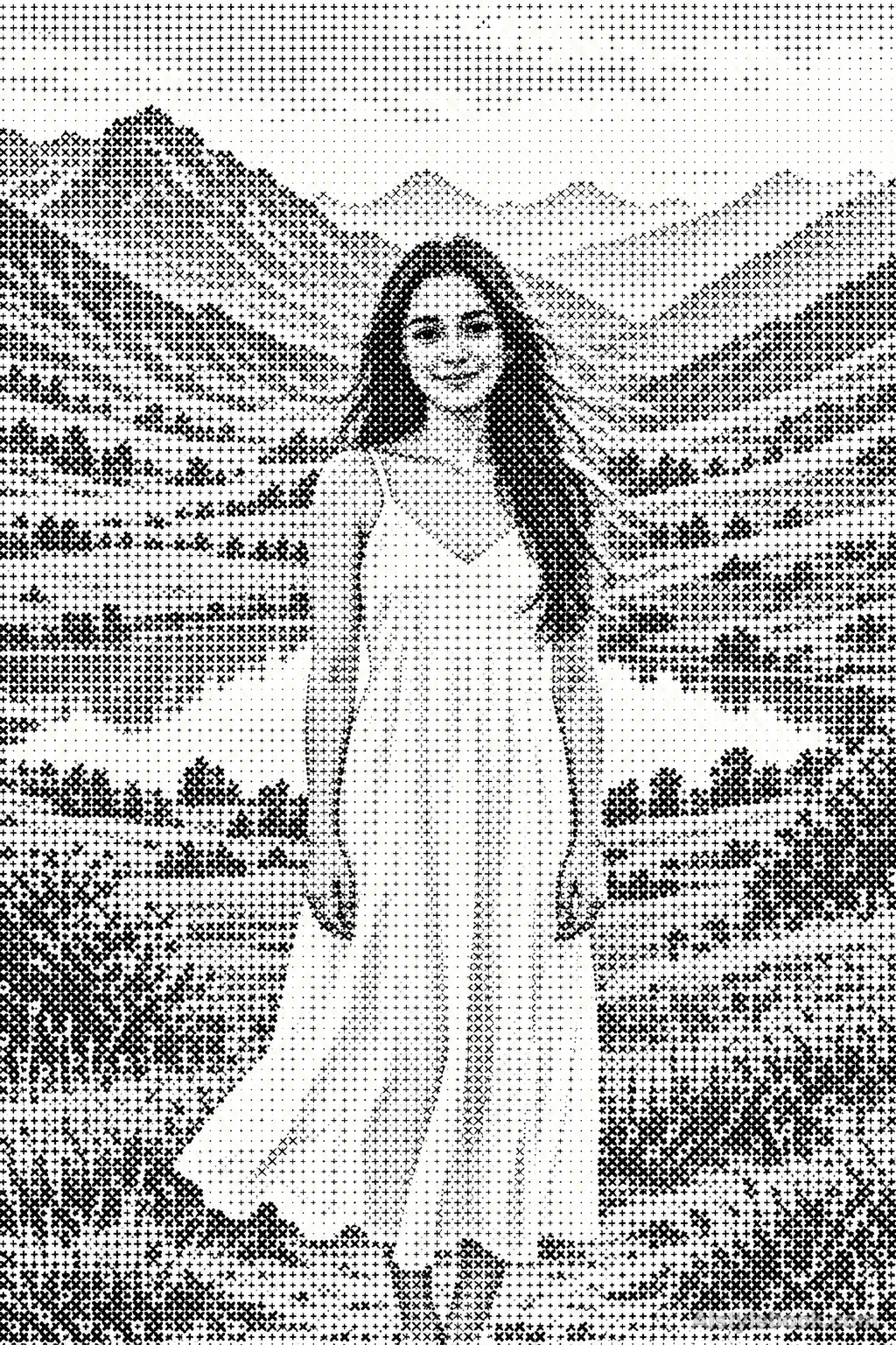
PortraitStyle effect

LandscapeStyle effect
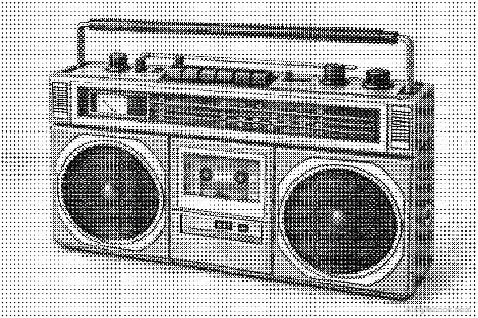
ObjectsStyle effect
The visual language
What is Cross-Glyph Screen?
A cross-glyph screen limits each cell to a plus or diagonal cross. The image emerges through glyph size and distribution. Spaces between the four arms stay visible even in shadows, creating an open texture that reads as graphic sampling rather than embroidery or written text.
Cross-glyph screens preserve their four-armed units as coverage changes.
Small forehead crosses growing and gathering near a hairline can produce tone while remaining identifiable symbols close up.
How the style changes different subjects
- Portrait
- Fixed dots or glyph units sample facial tones into regular density changes.
- Landscape
- Consistently spaced units turn scenery into clear outlines with abstracted texture.
- Objects
- Unit size or coverage models curves as an ordered tonal field.
- Subjects
- Choose large portraits, buildings, flowers or single still lifes with broad tonal areas readable at a distance.
Bring the style to your photos
Reusable style prompt for Cross-Glyph Screen
Construct the entire image from clearly separated plus-sign and diagonal-cross glyphs on a regular grid. Keep each mark centered in its cell, with consistent stroke weight and controlled changes in size according to local tone. Use dark marks on a light ground, allowing the empty spaces between arms to remain visible. Let dense larger crosses build shadows and smaller sparse crosses preserve highlights. Retain the source silhouette and large value relationships, with no mixed letters, fabric stitches, continuous hatching or concealed photographic shading.Use the same style prompt for portraits, landscapes and objects.
Create with this styleKeep exploring


