
Light & Image Effects
Duotone Color Grade
Style guide
Deep indigo shadows blend continuously into warm coral highlights through a controlled two-color tonal map.
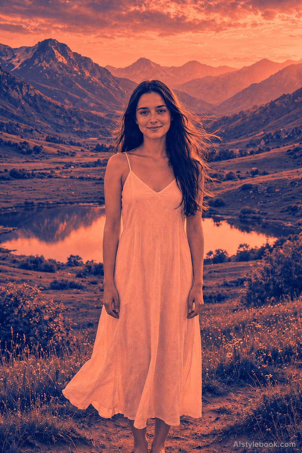
PortraitStyle effect
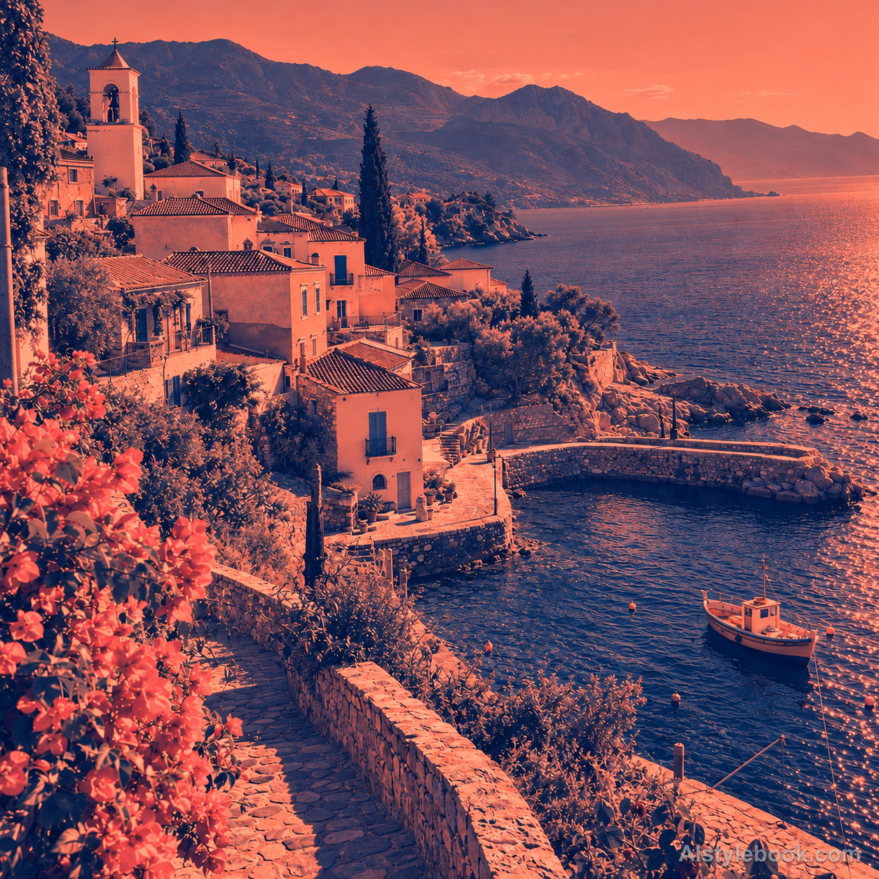
LandscapeStyle effect

ObjectsStyle effect
The visual language
What is Duotone Color Grade?
Duotone replaces natural hues with two chosen colors and blends continuously between shadows and highlights. A consistent luminance structure preserves the forms while giving a complex photograph a compact, distinctive color identity.
This digital duotone treatment maps values between chosen colors rather than necessarily simulating two printed inks.
Blue shadows blending into pale apricot highlights can preserve texture while replacing natural color.
How the style changes different subjects
- Portrait
- Tone-based color mapping replaces skin and clothing hues while preserving features through light and shadow.
- Landscape
- Brightness remaps scenery into a new palette while retaining its tonal depth.
- Objects
- Color no longer identifies material; contour, highlight and shadow carry recognition.
- Subjects
- Choose tonally rich portraits, buildings, mountains or smooth objects that do not rely on specific colors for identification.
Bring the style to your photos
Reusable style prompt for Duotone Color Grade
Remap the entire tonal range into a strict duotone palette with deep indigo at the darkest values and warm coral at the brightest values. Intermediate luminance blends smoothly between those two endpoints, preserving clear contours, tonal hierarchy and fine image detail. Remove residual natural hues. The result should read as an intentional continuous-tone two-ink color treatment, without halftone dots, hard posterization steps or additional rainbow colors.Use the same style prompt for portraits, landscapes and objects.
Create with this styleKeep exploring


