
Illustration & Design
Posterized Color Bands
Style guide
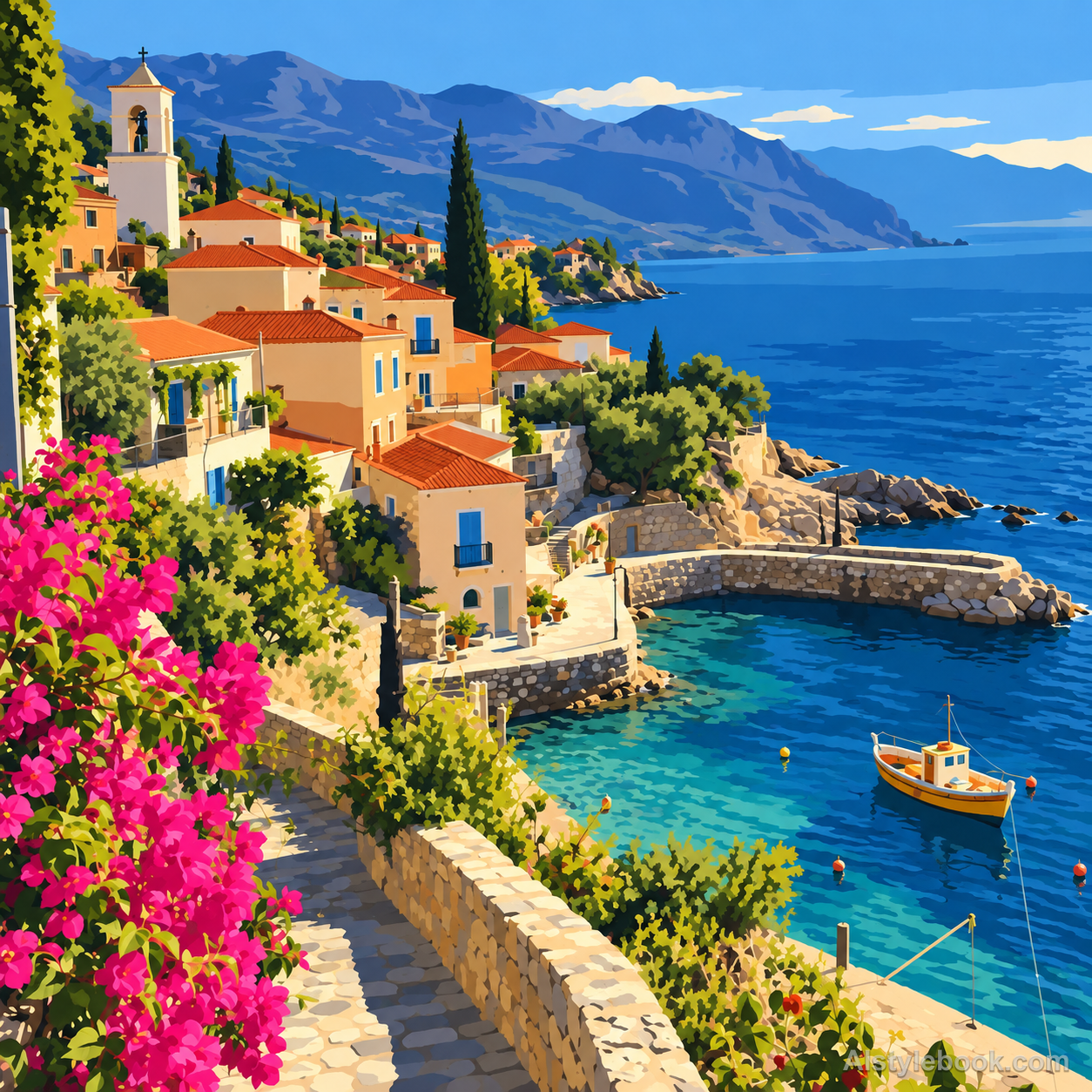
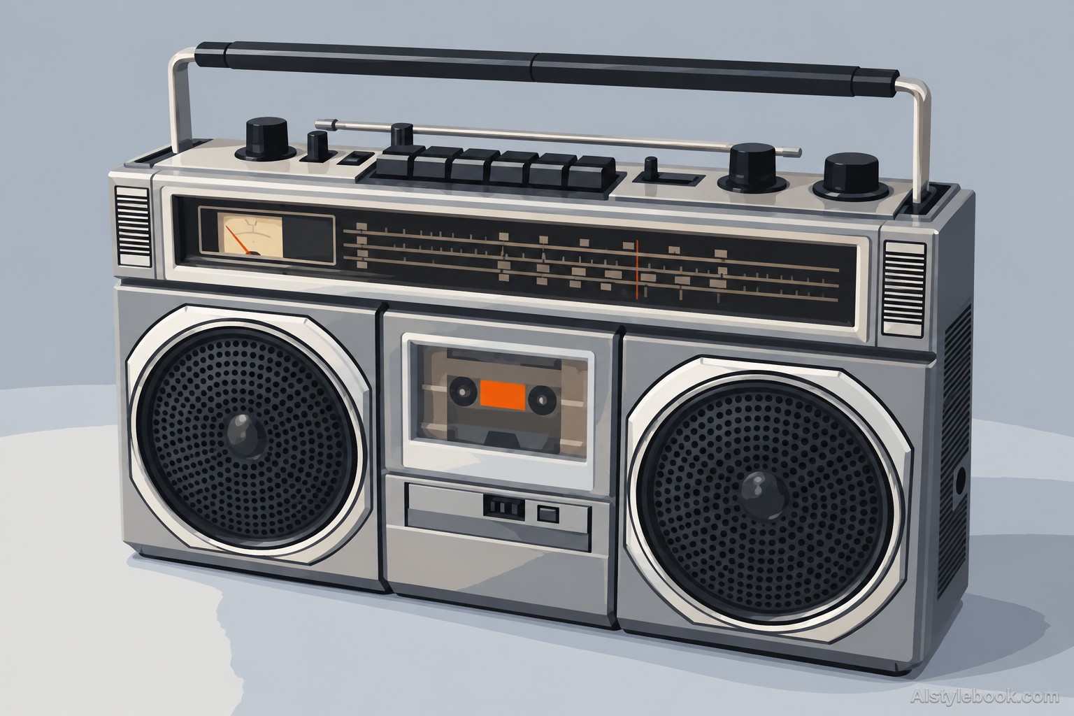
Continuous tone compresses into a few flat color bands, with crisp boundaries following the original forms.

The visual language
What is Posterized Color Bands?
Posterization preserves existing contours and lighting but compresses smooth gradients into a few color levels. Bands follow the original value transitions, keeping a photographic basis. The graphic impact comes from reducing tonal range rather than inventing a new geometric composition.
Posterization groups continuous values into fewer levels while retaining light-driven boundaries.
Four skin-tone bands from forehead to cheek can flatten a portrait without losing its photographic structure.
How the style changes different subjects
- Portrait
- A few tonal bands replace skin gradients, clarifying facial planes and reducing fine texture.
- Landscape
- Brightness regions simplify clouds, buildings and terrain while following source contours.
- Objects
- Limited bands divide reflections and curves into a flattened photographic form.
- Subjects
- Choose side-lit portraits, buildings, clouds or smooth objects with broad continuous tonal gradients.
Bring the style to your photos
Reusable style prompt for Posterized Color Bands
Posterize the complete image into a small controlled number of flat tonal color levels. Retain the source hue relationships and existing contour structure while replacing every smooth gradient with clearly separated, coherent value bands. Use crisp boundaries following existing light and material transitions. Keep broad shapes readable and remove tiny noisy islands rather than inventing new geometric symbols. Produce an opaque two-dimensional graphic finish without halftone dots, outlines, brush texture, added typography or continuous photographic shading.Use the same style prompt for portraits, landscapes and objects.
Create with this styleKeep exploring


