
Light & Image Effects
Gradient Map Color
Style guide
A continuous violet-to-blue-to-cyan-to-gold gradient replaces original hues according to image luminance.

PortraitStyle effect
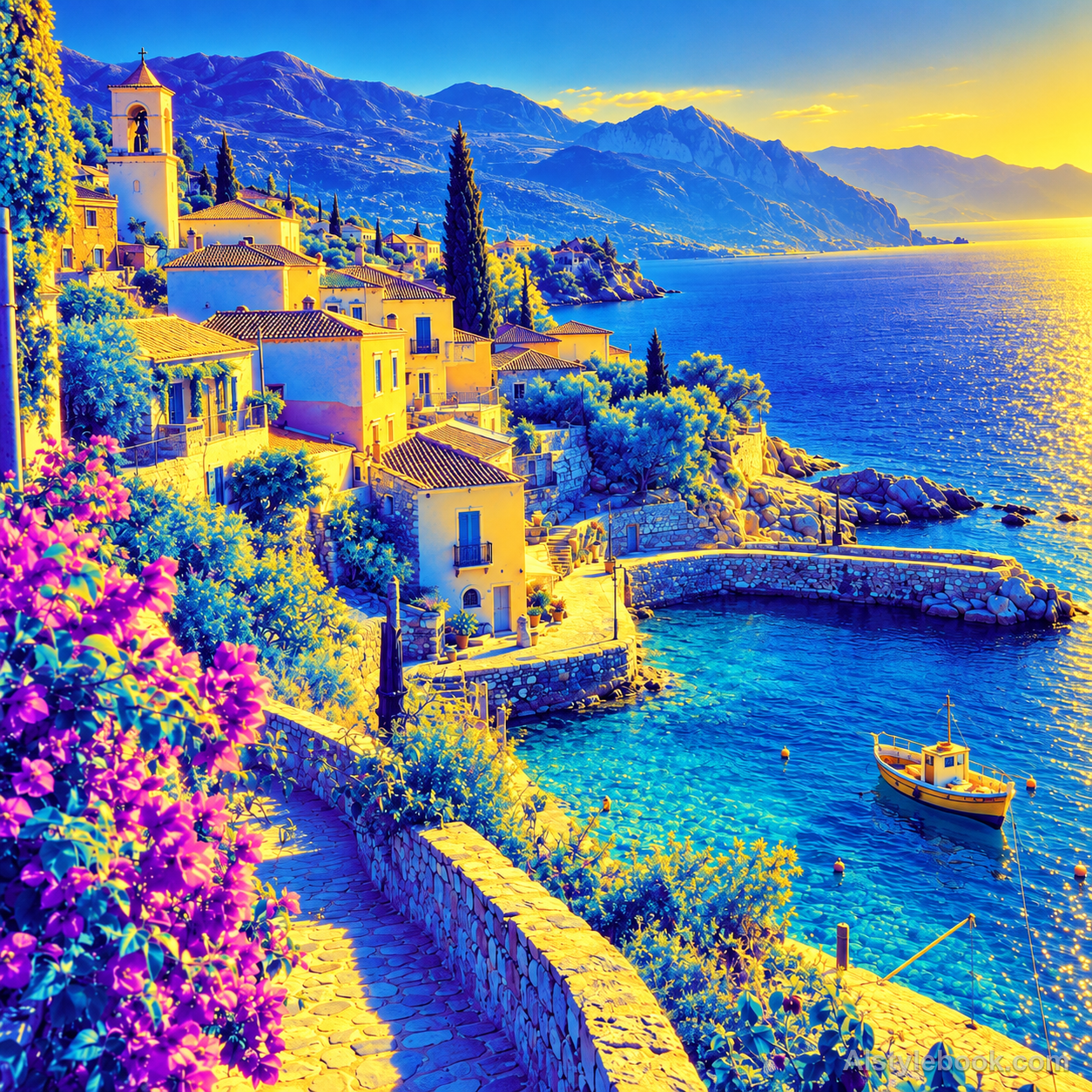
LandscapeStyle effect

ObjectsStyle effect
The visual language
What is Gradient Map Color?
A gradient map assigns each luminance value to a position on a color ramp. Violet shadows, cyan-blue midtones and pale gold highlights create ordered, continuous false color while retaining the original tonal detail.
Gradient mapping assigns colors by tonal value rather than image position.
Equally bright cheek and wall regions becoming gold, with purple shadows and cyan midtones, creates one consistent color scale.
How the style changes different subjects
- Portrait
- Tone-based color mapping replaces skin and clothing hues while preserving features through light and shadow.
- Landscape
- Brightness remaps scenery into a new palette while retaining its tonal depth.
- Objects
- Color no longer identifies material; contour, highlight and shadow carry recognition.
- Subjects
- Choose tonally rich portraits, buildings, mountains or smooth objects that do not rely on specific colors for identification.
Bring the style to your photos
Reusable style prompt for Gradient Map Color
Replace natural colors with a continuous luminance-driven multicolor gradient: deepest violet shadows transition through cobalt blue and cyan midtones into pale golden highlights. The same brightness must map consistently to the same gradient position throughout the image. Retain original tonal edges and fine structural detail, using smooth color transitions rather than flat quantized bands. This is a decorative gradient map, without thermal labels, material classifications or invented measurement overlays.Use the same style prompt for portraits, landscapes and objects.
Create with this styleKeep exploring


