
Illustration & Design
Editorial Magazine Poster
Style guide
Geometric flat colors, hairline contours and sparse dots create an airy editorial illustration.

PortraitStyle effect

LandscapeStyle effect
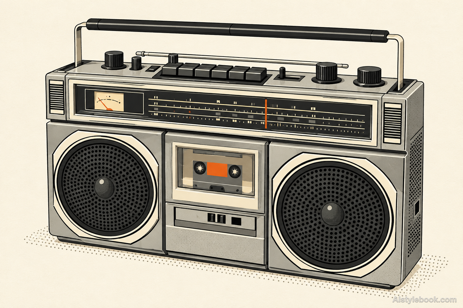
ObjectsStyle effect
The visual language
What is Editorial Magazine Poster?
A few fitted geometric patches reorganize complex forms as clear editorial illustration. Hairline contours identify essential structures while cream, gray and muted accents leave room to breathe.
Editorial posters use scale, cuts and fine lines to establish a reading order.
A large gray shape, small ocher-red focal accent and open cream margins can reveal details in stages.
How the style changes different subjects
- Portrait
- Pose, face and clothing become the editorial focal point within a more unified background and palette.
- Landscape
- Large color and image areas establish hierarchy, favoring landmarks over scattered detail.
- Objects
- Silhouette and material take center stage, with space and cropping reinforcing focus.
- Subjects
- Choose clear portraits, a single landmark or an isolated product with room around the subject.
Bring the style to your photos
Reusable style prompt for Editorial Magazine Poster
Draw every form as a magazine editorial illustration on warm-white paper. Construct the subjects from clean geometric color patches, with hairline contours emphasizing only key structures and sparse dots adding light grain. Use cream, gray and two muted accent colors. Let active whitespace, simplified shapes and fitted color planes establish hierarchy and space, maintaining a clear, coherent flat drawing language.Use the same style prompt for portraits, landscapes and objects.
Create with this styleKeep exploring


