
Illustration & Design
Retro Poster Style
Style guide
Strong contours, broad color blocks and mellow spot colors combine with subtle print grain for a classic poster character.
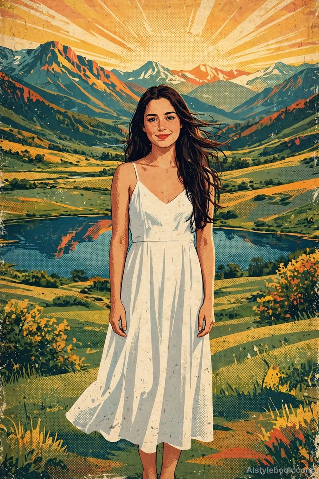
PortraitStyle effect
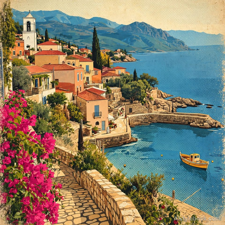
LandscapeStyle effect
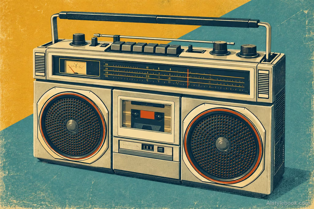
ObjectsStyle effect
The visual language
What is Retro Poster Style?
Immediately readable silhouettes and broad tonal blocks create a clear focal point. Warm spot colors, fine paper grain and ink variation give the planes vintage-print weight.
Vintage poster structure depends on readable silhouettes and large color areas before paper wear.
Three mountain layers and a winding road can direct attention toward a pass without describing every tree.
How the style changes different subjects
- Portrait
- Strong tones and limited colors turn pose and clothing into a bold visual emblem.
- Landscape
- Landmarks, sky and roads form large graphic divisions with emphatic perspective.
- Objects
- Objects condense into striking shapes, reducing small lettering and literal surface detail.
- Subjects
- Choose distinctive poses, freestanding landmarks, aircraft or recognizable products with clear background separation.
Bring the style to your photos
Reusable style prompt for Retro Poster Style
Use the graphic language of twentieth-century vintage posters, distilling the subject into strong contours, broad color blocks, and clearly divided light and dark regions. Establish a striking hierarchy and visual center through a limited palette of vintage spot colors. Keep tones rich without excessive vividness. Add subtle screen-print grain, paper texture, and uneven ink coverage, letting concise, forceful shapes carry the poster aesthetic.Use the same style prompt for portraits, landscapes and objects.
Create with this styleKeep exploring


