
Printmaking & Printing
Solid-Ink Screen Print
Style guide
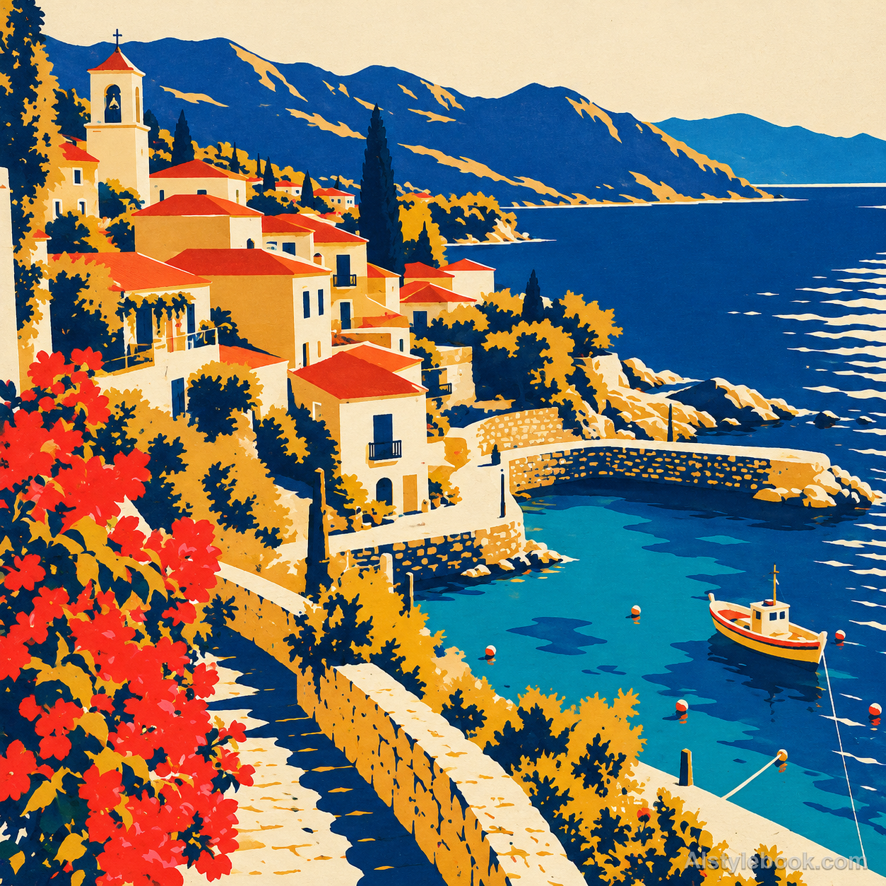
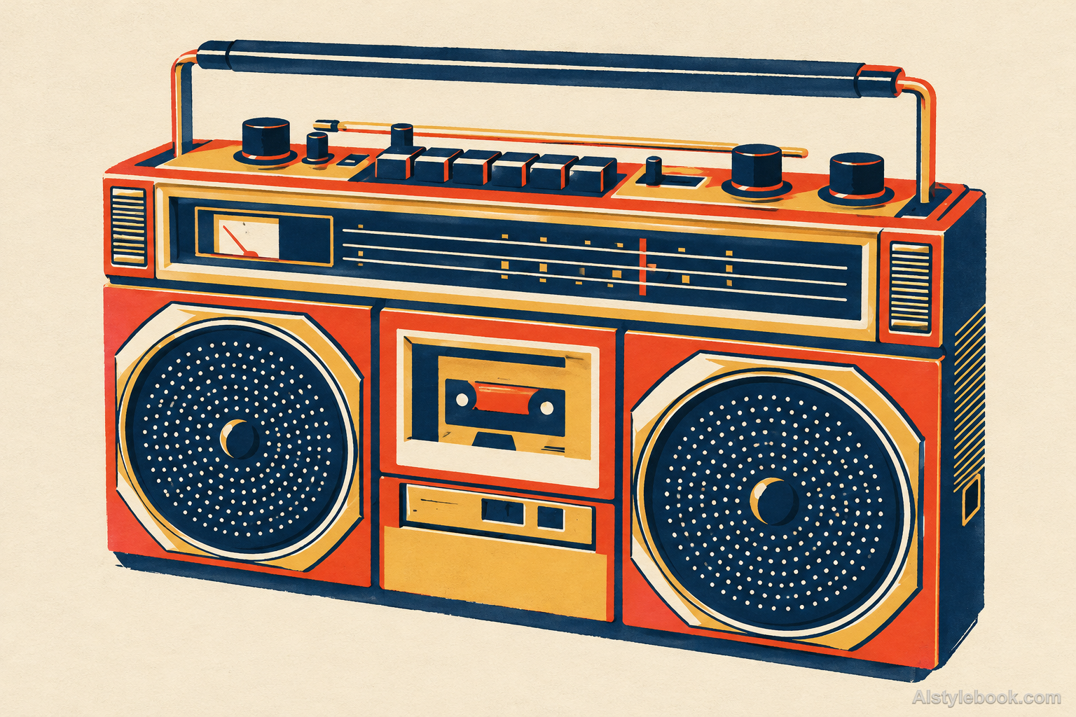
A few opaque spot-color layers form dense even ink films with clear plate edges and faint squeegee marks.

The visual language
What is Solid-Ink Screen Print?
A few interlocking spot-color plates organize the picture. Dense ink fields and unprinted paper describe light and shade, with small overlaps and edge variations retaining a hand-printed character.
Solid-ink screen printing uses separate stencil layers, overlap and exposed paper rather than requiring dotted shading.
A blue tree crossing a red sun can retain the sense of a few distinct printing passes.
How the style changes different subjects
- Portrait
- Limited printed colors unify skin and clothing with grain, drawn marks or overprinted edges.
- Landscape
- Separable color layers emphasize broad skies and architectural shapes.
- Objects
- Printed color and bare paper replace reflections, adding ink texture and simplifying small lettering.
- Subjects
- Choose clear figures, buildings, flowers, fruit or simple products recognizable in a limited palette.
Variant relationship
A dense solid-ink variant of Retro Poster. Compare with Retro Poster.
Retro Poster includes broad vintage-paper, grain and palette treatments. This variant concentrates on dense screen-printed ink: more even solid fields, sharper plate edges and only narrow overlaps or squeegee traces, avoiding Risograph-style dense halftone dots.
Bring the style to your photos
Reusable style prompt for Solid-Ink Screen Print
Preserve the source composition and recognizable forms. Separate the image into four broad opaque screen-print ink plates: deep navy, vermilion, warm ochre and cream paper. Make large smooth continuous ink fields with clean hand-cut plate boundaries, simplifying shadows into solid interlocking regions. Show very subtle mesh impressions or squeegee drag only in a few ink edges, a slight raised ink-film lip and tiny controlled registration overlaps. Keep most color interiors dense and uniform. Let cream paper appear through intentionally unprinted shapes. Avoid continuous tonal shading, dense halftone patterns, dusty risograph grain, distressed vintage stains, watercolor, wood grain and added typography. Use exceptionally broad unbroken ink regions, not a finely detailed vintage engraving. Reduce each major source form to three or four large interlocking color shapes. Absolutely no grain inside the ink fields, tiny foliage dots, faded paper stains or fine scratches. Keep any physical ink edge detail confined to the boundary.Use the same style prompt for portraits, landscapes and objects.
Create with this styleKeep exploring


