
Pixels & Characters
Vertical-Stroke Screen
Style guide
Separated vertical strokes build tone through length and density, with a steady barcode-like rhythm.

PortraitStyle effect

LandscapeStyle effect
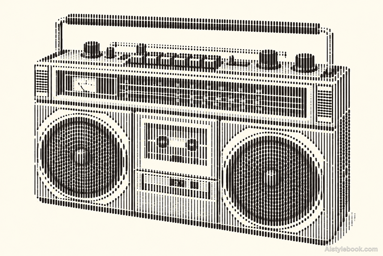
ObjectsStyle effect
The visual language
What is Vertical-Stroke Screen?
Vertical screening keeps fixed column spacing and visible breaks between rows. Changes in stroke length and occupancy reconstruct the image. It produces neither continuous stripes nor a scannable barcode: the steady upright rhythm reduces detail to discrete marks.
Vertical screens use separate strokes, with row breaks and changing lengths preserving detail.
Longer trunk marks tapering near leaves can describe a tree while maintaining a clear column rhythm.
How the style changes different subjects
- Portrait
- Fixed dots or glyph units sample facial tones into regular density changes.
- Landscape
- Consistently spaced units turn scenery into clear outlines with abstracted texture.
- Objects
- Unit size or coverage models curves as an ordered tonal field.
- Subjects
- Choose large portraits, buildings, flowers or single still lifes with broad tonal areas readable at a distance.
Bring the style to your photos
Reusable style prompt for Vertical-Stroke Screen
Reconstruct the complete image using separated vertical line segments placed at fixed intervals on a regular grid. Keep the segments perfectly upright and uniform in basic width, modulating their length and local occupancy by source tone. Leave clear breaks between rows and visible light gaps between neighboring strokes. Use dark marks on warm white, allowing large contours to arise from the collective field. Avoid horizontal carrier lines, joined curves, readable barcodes, letterforms, rain photography or a continuous gray image behind the marks.Use the same style prompt for portraits, landscapes and objects.
Create with this styleKeep exploring


